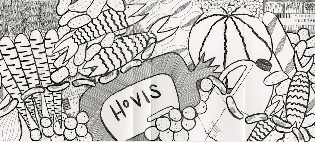
Heres how my cover started out:
Literally can you believe I actually made this with my actual hands?!?!?!?!?
I'm chuffed.
Then I added the colour I'd decided on, a nice burnt orange colour which me and my flatmates agreed connoted waste and rubbish. At first I only added the colour to the original black line drawing, but after some consideration I actually thought this looked too graphic.
So I fiddled around (for WAY too long) on photoshop to try and work out how to change this black lines to white as I thought this would look less harsh and wouldn't look as chaotic with text layered over the top.
Much better. Then I decided what colour and thickness of text looked best on the cover which was all worked out with printouts in my sketchbook. I decided on the Kefa font on Photoshop in a thick weight and in a slightly off grey colour.
*Pause for a break whilst I figured out how to print it to fit my MASSIVE book.*


No comments:
Post a Comment