Monday 31 October 2016

Finishing Illumination

Today we had our feedback session and final crit of our illumination editorial brief. I have to admit, this ones been really hard, and its really not been something I felt I've excelled at, but considering this my final images went down well.

What went well:

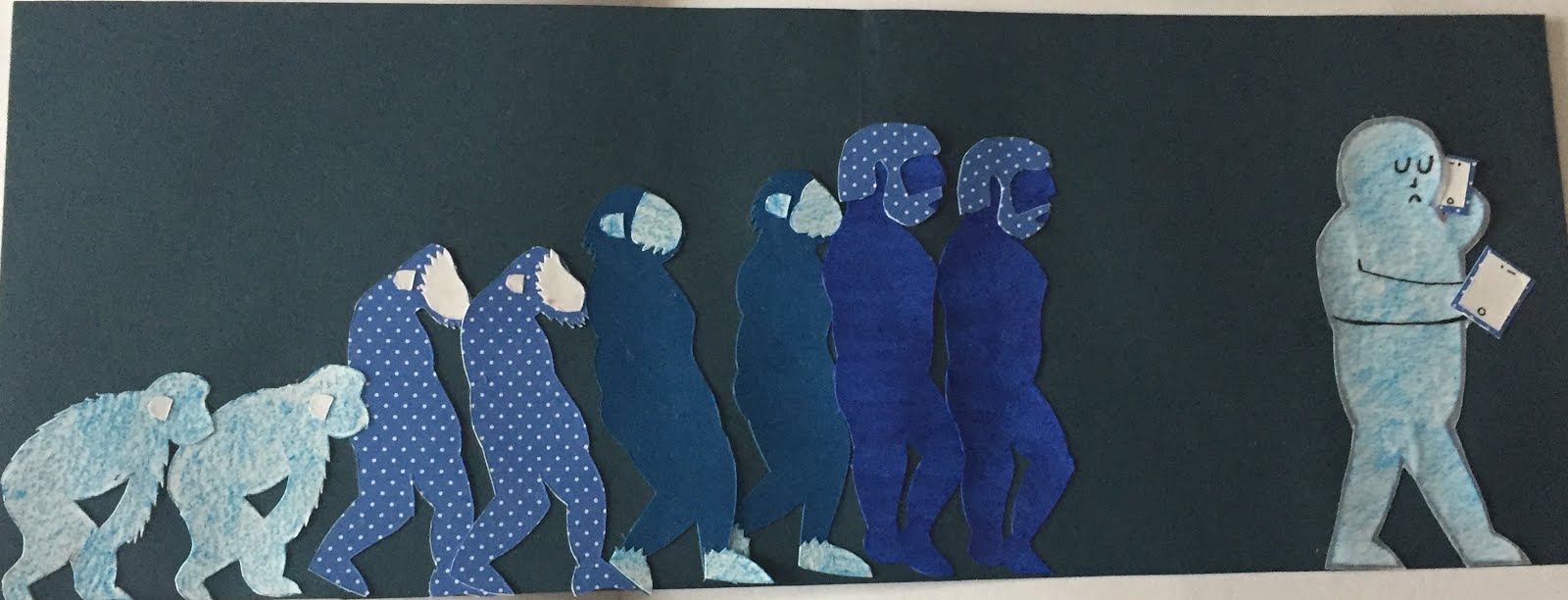
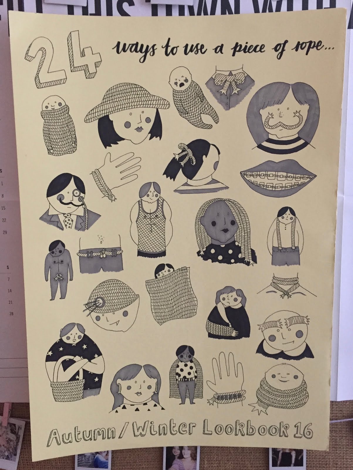
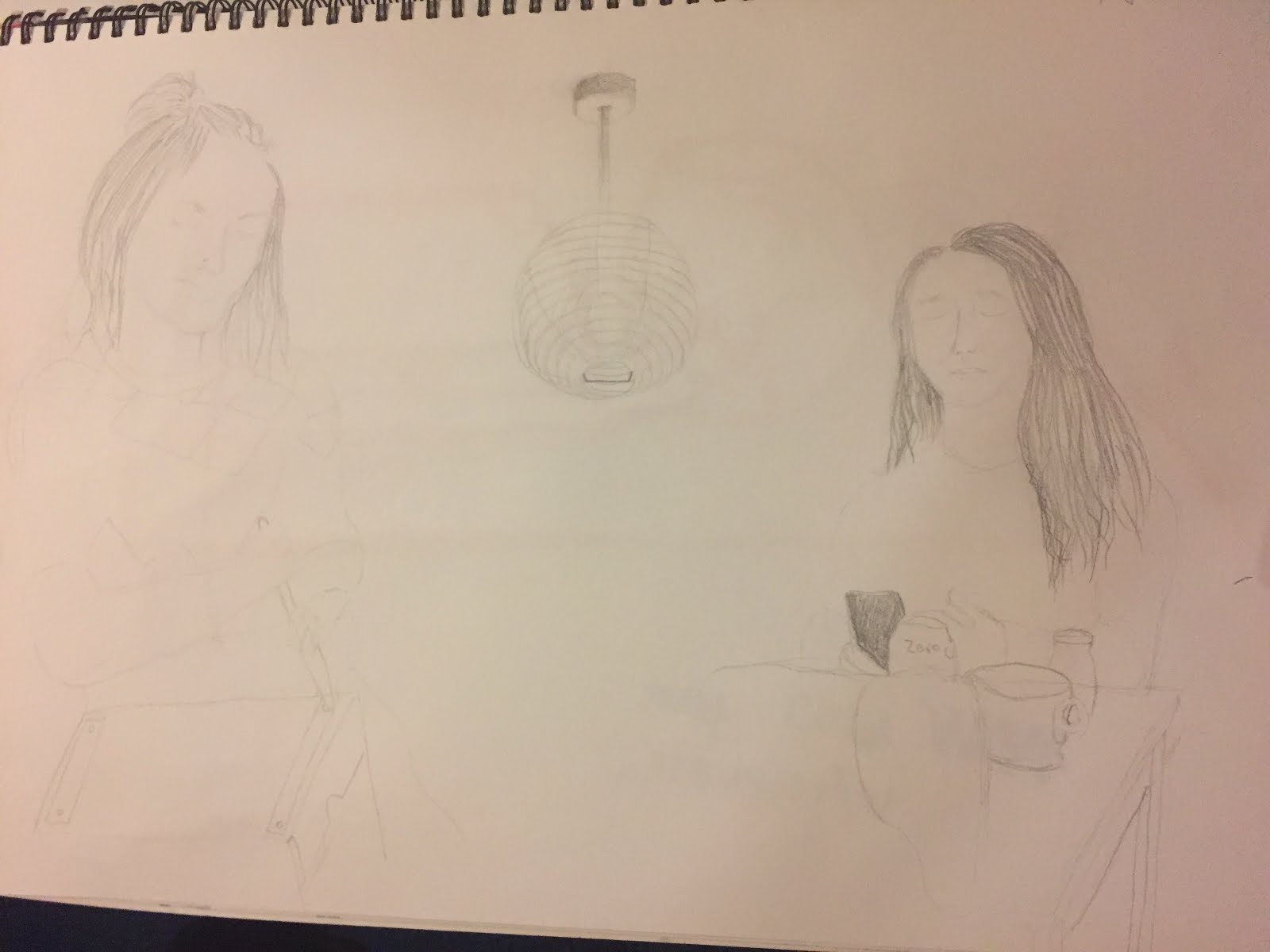
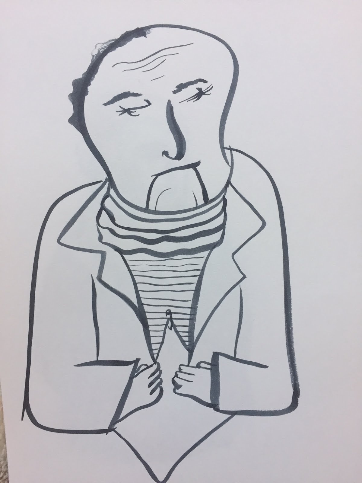
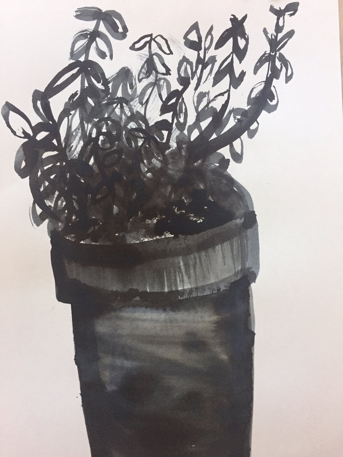
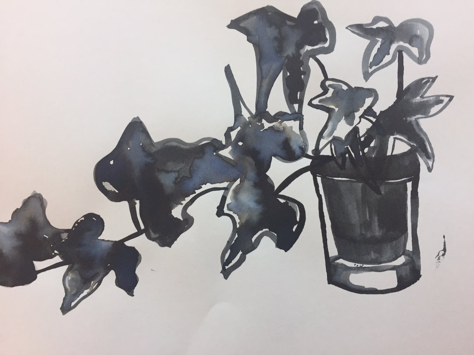
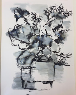
According to my peer feedback sheet, the elements of my work that were the most well received were the colour scheme used ( and how this matched the article), the materials and processes (the collage) and the simplicity of the images. I was SO chuffed with people commenting on the simplicity as this was something I really had to remind myself to do, to simplify what normally would have been very complex images in my work. Its shown me that it is possible and therefore I will do it again.

What can be improved:

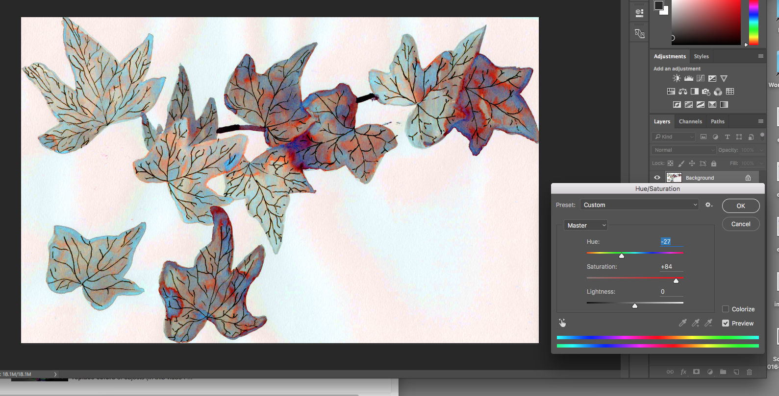
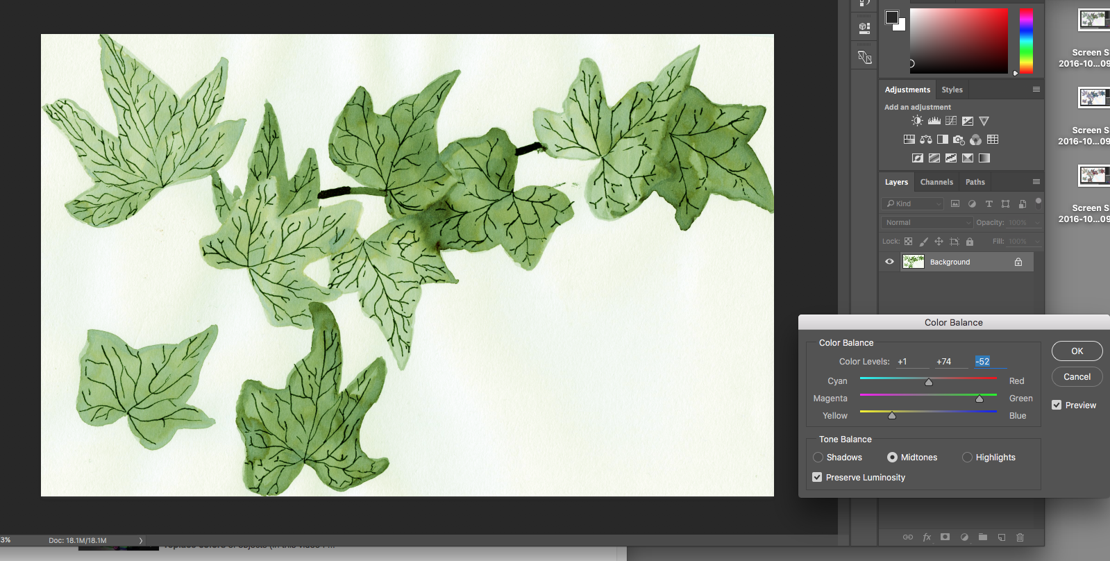
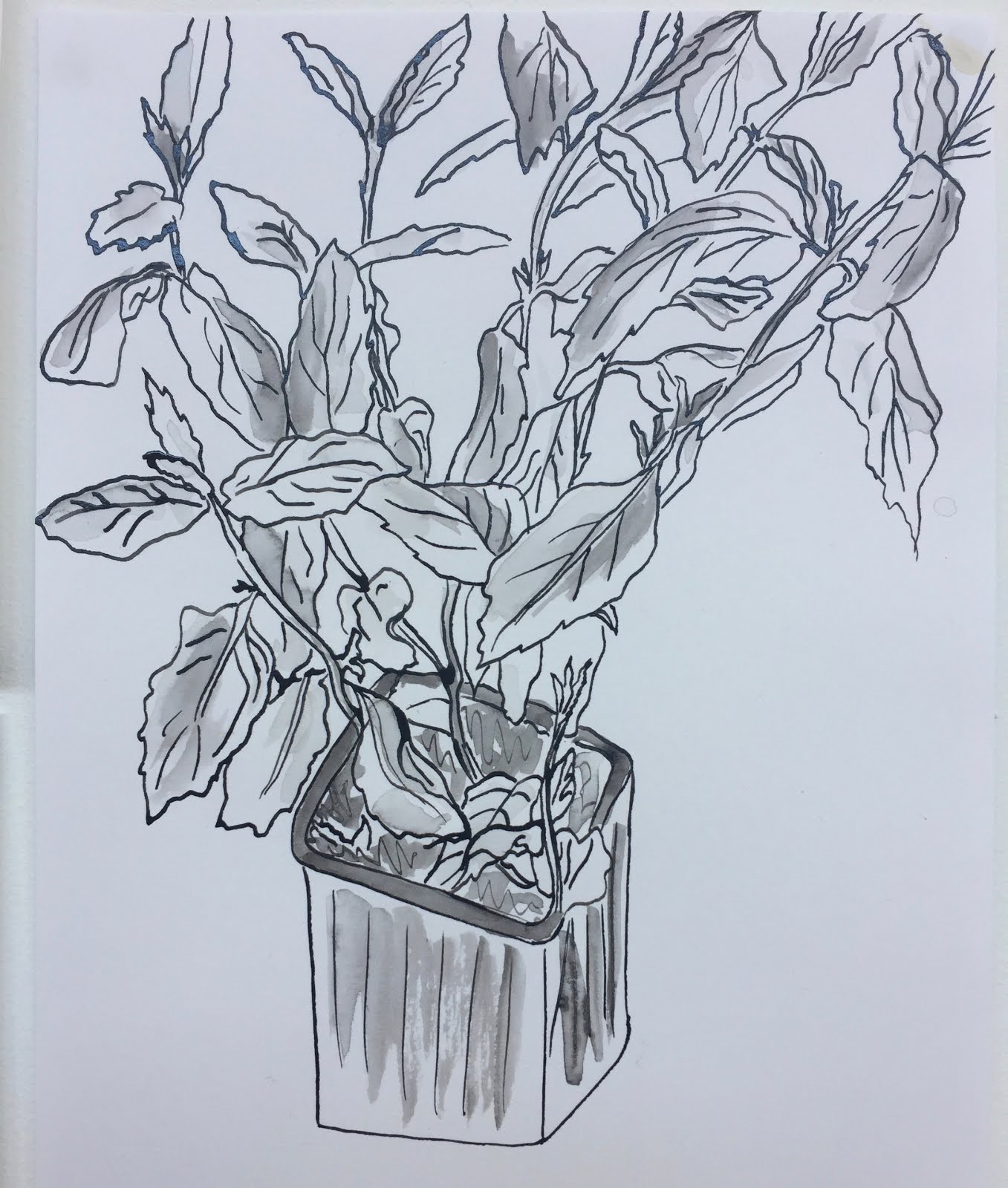
I actually got some really interesting critical feedback from this session, with a number of people suggesting that I used digital process to enhance the hand- drawn images. This is something I briefly did on the computer but only to neaten. Maybe now I could try editing colours and textures. Someone else suggested using textiles and sewing which was a suggestion that made me really excited. I've used this kind of process in work before and forgot how much I'd enjoyed it but can't wait to use it again soon!

The final suggestions were that I scanned in my images to flatten them which is actually something I had done but now realise it would have been more helpful to lay both handmade and scanned versions out side by side maybe for people to decide which worked better? As when put next to each other me and Holly both agreed we liked the handmade ones more.

Overall this project went much better than expected and I surprised myself by working successfully within size and colour constraints. I was also pleased that my peers managed to work out the themes of the images and didn't seem too confused by them.


Thursday 27 October 2016

Finally Finishing The Collage

TODAY I FINALLY FINISHED THE COLLAGE PORTION OF MY PEICES FOR ILLUMINATION. I'm so relieved because they actually turned out better than expected and I didn't even need to scale them up!


What went well:
I think the colour palette and the different textures really work well together and help give an otherwise simple image some interesting layers. I also think that the characters within those images work well together whilst still having different themes, you can still tell they correlate and belong to the same set. 

What could have gone better:
I was a bit messy and managed to get some glue marks on a lot of the paper, theres also a little crease down the middle of one of the pages. 

What next:
Now I'm going to scan these images into the computer both to enhance them in photoshop (get rid of the glue and creases etc), and to print out to look more finished.


Tuesday 25 October 2016

Using New Lines

After our seminar about line quality I've been trying to encourage myself to use my sophisticated line qualities and generally just give more consideration to what kind of lines I'm using and where. I chose to use the motif of some wrestlers faces in all my line drawings as I think they're quite interesting and enjoy experimenting with the colours and features of each different character. 

These two were some of my favourite outcomes. I used some thick graphite and quick, hard lines in conjunction with soft shading for detail. This was both quick and effective to do which is a mega bonus. However, I'm not quite sure how you would go about adding colour to this, maybe this is something that could be done on photoshop?

Friday 21 October 2016

Photoshop Task

Today I finally managed to feel confident enough in what I was doing on photoshop to edit my favourite ink drawing from the other week. I mainly only messed with the colour balance and the hue/saturation but I think they turned out ok! 


My original image

Edit 1:


For this one I mainly edited the levels of the image and ended up with this nice paler version of the original image. I think it would look effective for a children's book or maybe something with writing layered over it.

Edit 2:


For this one all I did was moved the hue and the saturation up. I'm not sure if this looks very good as it kind of gives the leaves a mouldy effect but its ok.

Edit 3:


I thought this one worked really well as it got some of the mouldy colours and some nice blues and pinks in there too. On this one the hue is at the highest level that it can be.


Edit 4:


I only really left this one in because the leaves in it look really autumnal and thats really fitting because its October now. I think this edit gives the most realistic life to this ink drawing and could see myself using it to colour other plant drawings. The hue is relatively low on this one. 


Edit 5:

On this one all I've done is gone to colour balance and upped the green and the yellow to get this nice leafy green. This one made it a lot more obvious that what I was working with was in fact a drawing of some leaves. I like it. In another edit I also used the brush tool to draw around some of the leaves which I quite like although its really time consuming.


Edit 6:


This ones a lot more stylised but definitely one of my favourites. I upped the magenta and red in the colour balance and it turned this really nice pink colour which I think brought out the line detail more. I also did another edit where I tried to fill in the blank space on the page with more leaves by copying a section of them and pasting. I need to work on this a little more but it looks ok.


In conclusion- I'm really still not proficient on photoshop but I am getting there. Practise makes perfect.

Wednesday 19 October 2016

Line Quality Is Ace

Today in our SP groups we learnt about quality of line and how important it is in making a quality drawing. We started off by learning the principles of line quality, which were very interesting but hard to wrap your head around (for me anyway). We then sat and made three different sheets of marks, one straight lines, one circle, one square and one zig zag, this was really challenging but made me realise that I really only ever use either a fine pencil line or a thin fine-liner line. 

We then made a few portraits of people in our class using our marks, which was so interesting, I only made two as I realised it takes so much longer to make a decent image using a method your'e not used to. But my favourite one was the one using the end of a paintbrush and ink. I really like the varied line thickness and the shaky effect it gives. This method also makes it really easy to build colour starting with light strokes and adding more ink to create depth.


Using a thick square brush and quick strokes
Using the end of a paintbrush and ink

Tuesday 18 October 2016

Illumination Briefing

My quick-fire drawings to describe 'measure'
Yesterday we were briefed on the editorial unit were going to be beginning called illumination. First we did the quick fire drawings to try and describe a word we were given (mine was measure), in small squares. Everyone guessed my subject within a few second which hopefully means I might do ok at communicating the subject in the article? We were then given a random article and are being asked to make three illustrations in response to the article to illustrate what is being said. The article I was given is called 'Why the age of loneliness is killing us' by George Monbiot. Sadly he doesn't sound like the kind of man I'd get on with in real life because for the most part I thought his article sounded like he was making a problem out of not much, however he did make some good points. I'm going to start with my roughs tonight and see how it goes.

Final Typology Poster

Yesterday we had our mega crit where we all handed in our typology posters for the visual skills brief. Some of the feedback I received was lovely and I really enjoyed looking at everyone Else's work, there was such a diverse range of media and crafting.

What I think went well:
Personally I really enjoyed creating and developing all the characters that featured on the poster, especially the basket lady, and giving them all their own personality's and quirks. I think they were quite effective as they seemed to make people laugh which is ace! I also really enjoyed the quality of the paper that I worked on (haha that sounds really sad) as it allowed the fine-liner and pro markers to have a much better flow and made the colours look a bit more interesting. 

What I think could have gone better:
I think had I not been so panicked about the way my poster was structured and just taken a bit more time and care mapping it all out, ironically it probably would have looked better structure wise. It was OK but some of the vignettes that I didn't like as much ended up being bigger on the page than some of my favourites. I also fudged up the end of the calligraphy style title at the top of the page which was annoying.

Tuesday 11 October 2016

Sketchbooks

Today we had a briefing for the first task in the visual skills module. We were given a list of themes and told to pick one, research it through the library and any other methods we chose, and then fill 6 pages in our sketchbooks in response to the theme. I picked the theme of American Wrestlers as this was something I spent a lot of my childhood watching and playing with my brother, and something that still fascinates me. I started to just sketch out some basic character pages, getting really hooked on drawing as many different angry wrestler faces as I could think of. For today I stuck to working with simple materials, starting with fine-liner and marker pens, and then experimenting with crayon later. Whilst I was working on the third page at home, I started working with a bit of collage which is an old favourite of mine. This was my favourite outcome, the image has a lot of depth and texture and the bright colours really bring the character to life.

Monday 10 October 2016

Refining My 24 Sketches

This evening was spent sketching out the kinks in the work I've done so far, I've found it really helps me to repeat the same characters and scenarios a few times as it helps to work out the logistics. Its difficult to draw some things for the first time as I'm working completely from my mind, but after a few tries they usually turn out ok. This method is also helpful for working out which colour scheme looks the best, especially whilst working in this monochrome which is not something I'm used to  it helps to be able to plan things a few times and work out what looks good. I am really enjoying the characters that are developing through this work, which I think is exacerbated when you add the coloured layer underneath such as with the yellow paper. The brown paper also works quite well as it helps to bring our the colours well but adds a layer of texture. 


Drafting My Final Poster

Today we did a review of our 100 sketches for the typology poster in the studio. We left our pages out on the desks and then walked round to circle things we liked and leave feedback, it was really so helpful to see everyone else's work and how they're piecing everything together. From the feedback I got I could see that a lot of people had said they liked the drawings which showed people wearing the rope garments, and also the ones which had a bit of a sense of humour to them. These too subjects definitely seemed to intertwined and got a good reaction from people which is nice to see as I would like for my final product to be humorous. 

From this feedback I then sketched three ideas of what my final product could look like, including different ideas around composition, theme and the idea they're trying to portray. The first one is simply a list of 24 ways in which to use rope, with a title at the top. The vignettes were a few of my favourites selected with no running theme arranged in quite a close way. Although I liked this I wasn't sure if it made enough sense or looked affective enough that it would make sense to a random viewer. 

The second design was a list of 24 ways to use rope done in a look-book style, with the subtitle of Autumn/Winter 16' at the bottom just to give it some more context. Then I sketched all the sample images that showed people wearing the rope in some way. I personally think this one is the most coherent as the vignettes have not only the common theme of including rope but also have been further narrowed down to include only the fashion items, making them look a lot less jumbled. 


The last design was a rough sketched outline of a department store style building, in which I was planning to arrange the different sketches into clothing categories such as 'womenswear' and 'accessories' into different rooms or sections. Whilst doing this I realised how hard it was to first of all, split them into categories (some such as dental braces don't fit well into ANY category), and second of all it was hard to split it into male and female as most things were unisex. In principle this ones a good idea but maybe doesn't quite lend itself to the vignette style or the particular theme I've been given. 


I think overall I have decided to go with the second idea which is the look book style poster. This one communicates the idea the best and is something I would display. Now I'll do more experimentation with different characters and fashion items to include on the poster as I realised theres wasn't quite 24. Then I also need to narrow down what materials will be used and on which background. 

Sunday 9 October 2016

Drawing From Life (from home)

Over the last few days I've really been making an effort to try and get myself into the habit of just sketching around the house, especially focusing on trying to get myself used to drawing people. I'm still really critical and unsatisfied with the way I've been drawing people, I think my style looks overdone and un-realistic. But on the other hand think you can see an improvement in both confidence and ability, confidence is coming along quicker than ability and its still difficult for me to draw what I want to communicate in as few lines as possible, maybe I need to do some kind of exercise in simplified drawing?

Friday 7 October 2016

Finishing My 100 Ideas!

Today I finally finished my 100 idea sketches and managed to fill a whole 3 sides of A2 paper. I am so pleased with how they turned out, they all look like they have a common theme running through them. I'm also very happy with the wide variety of different ideas ranging from the ridiculous to some quite useful ones. This means I should have a lot of different options to look at when I narrow down my sketches in order to start my final piece. As I've really been enjoying drawing the people wearing garments made from rope, I'm now wondering if I could maybe do some kind of look-book style piece, maybe called "how to use a piece of rope... a fashion guide"?

Tuesday 4 October 2016

Visual Skills- Idea Generating

Last night and at home this evening I've been working really hard on cranking out all 100 ideas for my typology poster and I REACHED 100! In fact I actually got to 101 because Imogen suggested something to me at the last minute. Some of them are really random and therefore are going to be a little tricky to illustrate but they're a lot of fun. I've illustrated small sketches for around 35 of the ideas and have really enjoyed working on them, I'm getting more into it with every doodle. 

I think at the moment the few ideas that have excited me the most are the weirder ones such as 'kidnap someone' and 'take it to the movies' as they lend themselves much more to a visual narrative, which is something I'd really like my final poster to have. Currently I'm thinking it might end up being either a survival guide for the wild, or the story of a man who falls in love with a piece of string/lady. However I'm going to reserve judgement until all the designs have been completed and every ideas been explored.

Observational Drawing

Today we carried on with the module which we started last Tuesday which is OUIL404 visual language for which we were asked to bring in a plant and drawing materials. The first activity we did was to go outside the room to where there was a few images on the walls. We had to pick one, go back to the studio and draw it from memory. This was so much harder than expected as I remembered so little of what was on the image, it took me three goes to get anything I was happy with. Below are my memory drawings in order from first to last. The first one is actually not awful considering the circumstances, his face is just a hilarious shape. The last one I was pretty pleased with just because I liked the style it ended up fitting into, however, seeing the real photo after the exercise made me realise how few vital features I'd managed to recall.


We also then got given the image we were trying to remember and got a chance to draw it from reference, this made me feel really enthusiastic as it was nice to be able to see what I was trying to work from. However, it did make me think that drawing is a lot less stressful when no one knows what your drawing is supposed to be based on or look like.


The second activity was that we had to draw the plants we had brought in and try and experiment with different mark making and materials to record what we were seeing. This was really fun even though I didn't expect to enjoy it. I used only quink but messed around with a variety of different tools like thick and thin brushes and then a chunky square brush. By the end of the session, I felt much more confident in my skills and was actually excited about what was being produced. The last one is my favourite. 


This session was designed to get us thinking about drawing from different sources and it definitely did, although its something that's quite out of my comfort zone, I can really see the value of it. I think that drawing from reference is good as it gives you an image that might not be immediately or at all available to you otherwise. It really helps to broaden your spectrum of ideas and I know theres hundreds of pieces I'd have struggled to draw if not from reference. It also can help you to see the ways in which most people tend to see things, which in turn will help people translate the things you've drawn into something they can understand and identify with. However, I think that drawing from reference can also really inhibit you as its far too easy to just copy from something you're looking at rather than taking clues from it and subsequently making it your own work. You can become too fixated on making your drawing look as hyper-realistic as the image your referencing is which is completely fruitless as what your copying from already exists so therefore doesn't need to be reproduced. I also think it can be really tempting to just always copy from pictures which them means nothing your producing is your original opinion on how you see the world, which is far more interesting than how google images sees the world. 

Drawing from life in my opinion is the best way to make everything you make completely unique as no one in the world is ever going to view the same thing you are in exactly the same way which is such an exciting thought. It does mean nothing is guaranteed to go right the first time round, which is something I'm really struggling to come to terms with, but at the same time I realise the unpredictability of it is what makes it so special. The mistakes I have made over the last few drawing sessions have been the turning point of me looking at what I'm producing and saying "what can I do better?" and "what will happen if I change this?", which in turn has actually made me produce better work. I'm starting to see that drawing from life's main selling point is that how much you bother to look at the world directly influences how you see the world and also how you can then translate the world onto paper for other people to look at. 

Translation is still definitely something I need to work on, but I imagine its a skill that only comes with practise. At the moment, its like I can have a clear idea in mind of what I want an image to look like, but getting my hands to translate this onto the paper is hard. There are certain techniques that others in the studio apply that look amazing and seem to capture the subject better than ways I've tried, but I need to work on the connection between my brain and my hands that allows me to utilise these skills. I also need to look at ways to record something on paper that is simple enough so that it doesn't look like I'm trying to make it photo-realistic, but detailed enough so that people still know what it is. These two below I thought were perfect examples of that thing which I aim to achieve, but don't quite know how to yet. The first on has such nice soft colours for the leaves and then contrasts the harsh lines of the top. Its so simplistic but really communicates the idea of the plant and all its features well. The second on is so minimalistic and graphic, all they seem to have done is put really cleverly placed lines down and it looks like a finished piece. No unnecessary time has been spend faffing around putting leaves in the background because its all implied. 

Monday 3 October 2016

Visual Language: sketching from home


Today I felt ill so I was sketching a lot from home. After the sketching from life day we did in the park, I thought it would be a good idea to try and force myself to sketch people as its been identified as something that's not my strong point. I decided to sit in the kitchen and draw my flatmates as they were making dinner so they wouldn't be still for long which would force me to draw them quickly. 

Again I did find it challenging but can already feel myself getting used to it. The mechanics of the body and where the limbs are placed while doing certain activities is still a mystery to me, which maybe will come with practise but I think I should go to some life drawing lessons to understand it further. Hands are still really difficult for me, as are faces. I struggle with how much detail to put into the faces as if you put too much in it just looks harsh and unrealistic and over-thought, but if you don't put any facial features in (which I haven't) it looks TERRIFYING. 

After this I sketched the bottom of my bed as it appears when I'm laying on it as this is somewhere comfortable and the subject matter is something familiar to me. This kind of drawing, as in mainly objects, is well within my comfort zone as nothing is moving and you can just focus on perspective. However, as this is something I'm used to drawing, it didn't feel like that much of an achievement and wasn't a challenge to me. 

Lastly, I used my new brush pen (with water reservoir) from Fred Aldous, to sketch the things on my bedside table. I decided to use a soft red colour as it suited the kind of faded light that was coming from my bedside lamp and reflecting onto the glass of water and record player. This is much more fluid than my usual style of drawing but I enjoyed working in this medium as its quick but you still get a good result from it. 


Visual Language: Drawing from life


During this session we went out into the city and drew things from life, which is not something I'm at all used to doing. Although I know its something that quite important to practice, usually I rarely draw anything from life unless its reference for something specific. We went into the park first with lots of drawing materials and starting sketching, we had to focus on certain points of view such as from above or from below. Some of the materials I used were charcoal, fine liner, pencil and thick black pen, my favourite of which was the thick black pen as I think it looks really graphic and dramatic. The hardest to work with in my opinion was the charcoal as although it looked great, it smudged which made the sketches look a lot worse.

Things I thought were successful in this activity:
- Sketching the building at the university campus: I discovered I really enjoy sketching the ins and outs of buildings although its sometimes difficult to get the proportions down right first time.
- Using simple lines: Instead of trying to get a lot of detail down in one sitting, during this activity I specifically focused on trying to only record quick drawings and convey the idea of an object, not the whole thing. This looks really affective.
- Focusing on obscure angles: This made the sketches so much more interesting rather than just having a whole scene of a park that includes lots of scenery and people, I focused on smaller parts of my surroundings and because of this was able to give the pieces much more detail.

Things I thought I need to work on from this activity:
- Sketching people is HARD: Seriously I really struggle with drawing people, so usually I avoid it or just spend ages perfecting the drawings. But with the quick sketching tasks we were being set it meant we had a smaller amount of time to capture people in. Its really hard to get a likeness using only a few lines. This is something I need to work on and stop putting off, PRACTICE MAKES PERFECT.
- Its OK to make mistakes: I know this sounds really cheesy but it definitely is true, at art A level, we were told that the pieces of work in our sketchbooks would be graded better if they were more complete and basically all looked like final pieces. I'm still trying to train myself not to think like that anymore, and even through a few hours of practice and development, you can see the difference in my work.