Tuesday 28 February 2017

Catcalling, Kindness, Vaginas And Of Course Dogs

For the last week I've been working really hard on the roughing of my stickers to promote a change, and this has made me realise a few things:

1. I care deeply about A LOT of things, seriously I had no idea that I was so impassioned about so many changes in the world until I started roughing this project. I started with a list of 10 changes and spent the first week only focusing on 5 of those because I had so many ideas. Even though I can only pick one to do for this project, I'm definitely going to pursue making some of the other ones for my self and to sell.

2. I work really well in a circle format. I think this is another thing to do with me being an organised weirdo who likes putting constraints on projects, but I've managed to come up with some really eye catching stuff within the parameters given which I'm really excited about

3. The idea of only working in three colours really doesn't panic me like it did at the beginning of the course. Now I think it actually makes me feel a bit calmer because when I have so many ideas like I do for this project, it means that I can narrow them down on the basis that some ideas will translate better in only two colours whereas others would be almost impossible.

This being said I do now need to work out which idea I'll be going with, here are some of my favourites and I might list some pros and cons next to them to help me work it out in my head:


 1. This ones for the adopt don't shop campaign, which is something very near to my heart as I worked with the RSPCA for a bit on my year off and it really opened my eyes to how many animals are completely needlessly abandoned and what that does for the animals mental health and well being. I think this ones a simple idea that will be immediate to a lot of people and the tagline is SO catchy. This is definalty a contender, also I really love drawing dogs so that helps. Could look pretty good done digitally.


2. These ones were based around the idea of Plan Internationals campaign called Because I Am A Girl, which works towards equal opportunity's for ALL girls, especially in regards to leading, learning, deciding and thriving. This one needs not as much explanation as to why I'm so for it, although a lot of the issues dealt with in this campaign are being tackled over-seas, the ones that I feel apply most here are the rights to contraception and abortion, and the rights for equal chance to be a leader. In particular on this sheet I really like the sticker with the pregnant belly outline as I think the shape itself is eye catching and immediate. I've really been enjoying using images of the female form in my work, I find it really comforting and inspiring to draw? The only issue with this sticker is I don't know if as many people will understand it at a glance as the adopt one? I'd probably have to put Plans website on there somewhere to make it more obvious. 


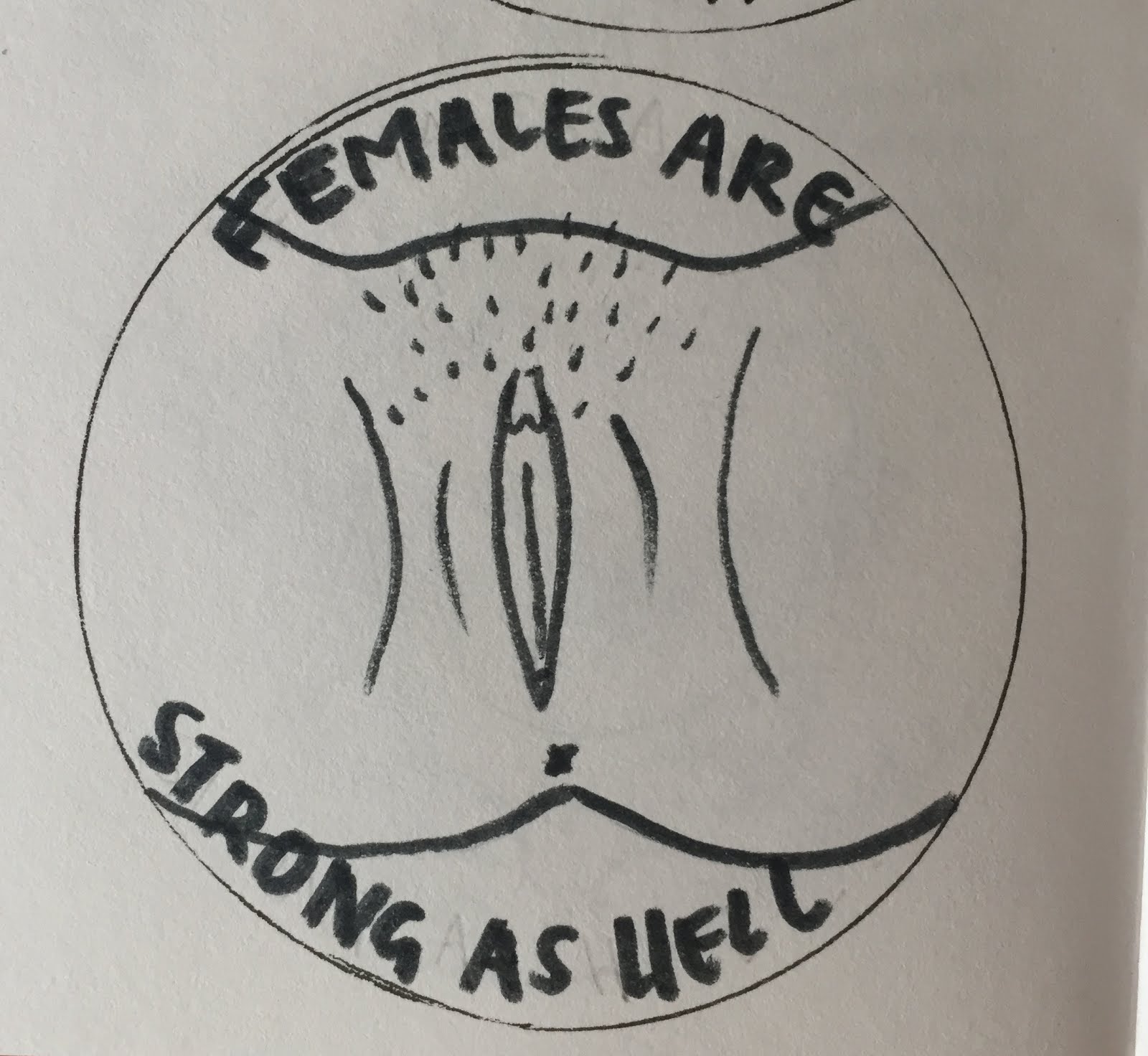
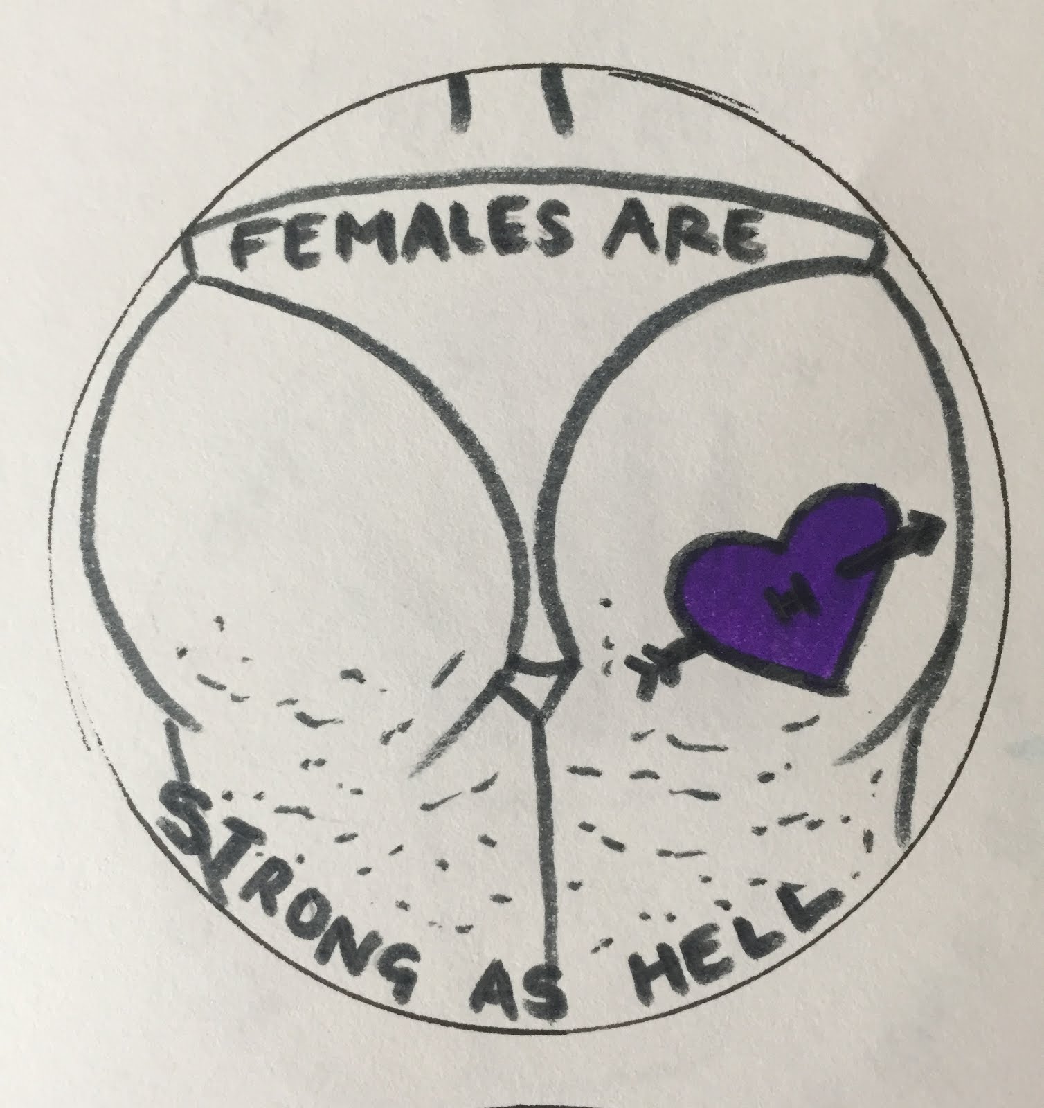
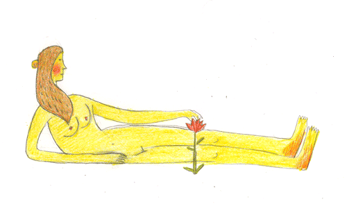
3. These stickers are visually, some of my favourites. I love the bold lines in them and could imagine them working really well digitally because really there isn't much to the design. These ones are to promote self love, which is in my opinion a really worthy cause, especially if they were displayed in uni or colleges where young, vulnerable women were to see them. The tagline is a line from the intro to Unbreakable Kimmy Schmidt which I think sums up the vibe I was going for here and is so empowering. I wanted to show slightly more controversial and inclusive images on these stickers, so I went for butt and vagina, both of which I've been told are shocking to look at but surely, shouldn't that be the point of a sticker? You would definitely notice it. The first one probably appeals to me more as I think its kind of a universal experience for women to sadly feel like their bodies aren't typically perfect, and it would be nice for more women to see the kind of bodies they actually have being represented, not the airbrushed kind you see in the media.


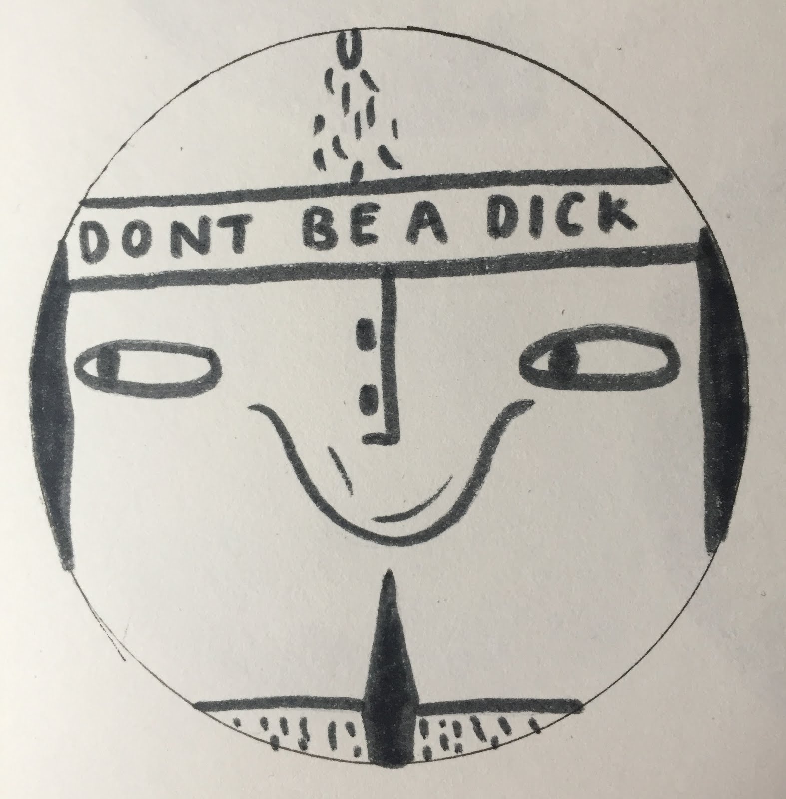
4. This ones kind of a funny idea but now that I'm looking at it, theres not really enough to it. I was going off the word play of 'Don't be a dick', but now I think the message isn't really strong enough? 


5. The last (good) idea I had was the idea of a sticker against catcalling, which again is something I'm very keen to erradicate from the face of the earth. For these I cam across the tagline of "Cats against Catcalls" which I think is a really light-hearted and playful way to talk about a big issue, and the "Not Your Babe" phrase I'd seen floating around the internet for a while. This ones designed as a phrase to throw back at people who feel the need to call you pet names or shout them at you from cars etc. This I think is one of the causes that I'm the most enraged about which is good as it gives me a lot to talk about, the tag-lines have given me a lot of great imagery to play with as well which helps (again, love drawing animals and bodies). If I were to go for one of these, I'd most likely go for one of the ones of the cats as I think the 'not your babe' slogan can be a little mis-enterpreted. Now I'm thinking about it, I'm not sure that those responsible for cat-calling would be likely to see these stickers, but I guess it could make quite a nice statement either way?


CONCLUSION: 


  • Still not a massive amount closer to figuring out what sticker is the right sticker. But I have narrowed it down to either self love, adopt don't shop or catcalls. So for todays Illustrator workshop I'll bring in my sketchbook and try and mock a few of them up digitally, just to see if that gives me a better feel for any of them. 

Monday 27 February 2017

Noma Bar- Vector Art

THIS IS THE KIND OF ART I WANT TO BE ABLE TO MAKE.


What is this absolute genius? I've always loved Noma Bar, since I saw pictures from Chineasy. I think the ideas are so clever but so simple, and the focus isn't on the making and intricacy of whats being made, but just on the simplicity of the design and what its saying. Its especially appealing to me in this brief where were being challenged to use only two colours, which is such an unnatural thing for me to do, but that Noma Bar does really well, selecting the colours to almost act as more words or details to describe whats happening in the image and how it should make you think and feel. The interplay between shapes is also something I really admire, and something that is so challenging to do, I feel to do this I need to really simplify my ideas down to the minimum level of detail, and then simplify them more. I'm beginning to see that so much of illustration is guessing, in the way that I think the best images, the ones that appeal to me most anyway are those that don't give you all the answers, instead you have to come up with them yourself and this often leads to you enterpretting it a completely different way to someone else, but in doing that you put your own spin onto it. 

Monday 20 February 2017

New Brief

Today we looked at every ones GIFs which were so ace! and then we got given the second part of this visual narratives brief, which is to design a sticker to encourage one change we'd like to see people make. I've already got a few ideas about this but I need to write them all down to organise them, but for now we did this exercise to simplify shapes and information as this sticker design will be made entirely on Adobe Illustrator (HELP).


At first you can see that I was really struggling with the idea of simplifying and if I'm honest, usually if I was just making this image for myself I'd probably have stopped at the fourth image (on the right) as this to me says everything it needs to say without too much embellishment. But we had to reduce it even further them make it out of paper cut shapes. Overall it was a stressful experience but I can see what this has achieved, sometimes I do need to just sit back and see if theres any way I can boil my work down into fewer shapes and have it still communicate what I'm trying to say. I know I have the tendency to over-complicate things but sometimes I need to slow down and take a step back, relying more on the idea of the image rather than the detail and flourishes.

Fargo Poster

Last week on Friday I went with Imogen to the print room to do our fan art posters. I was a little excited before but apprehensive because every screen print I've done before has been done in order to learn the process of it rather than because I actually had work I wanted to screen print. But this time I decided I wanted to make something that I really liked and that I personally would have on my wall at home. Obviously I chose to do it on Fargo because its one of my favourite films/shows ever and I knew it had a lot of beautiful imagery I could work with.

Here's the finished thing!!!!!!!!!!


Successes:
  • In terms of layout and composition, I really wrestled with whether this poster should have this layout or the snow scene layout in my last blog post which had a massive amount of white-space. Now its all been done, I'm so glad I went with this one, although the white space may have worked given the context it was in, I think I've realised that a lot of white-space on a screen print isn't something I'm a fan of in my own work.
  • The colour scheme has worked out so well! My only stipulation was that I wanted something with a blood red colour in it as this is so fundamental to the violent plot of Fargo, so Imogen chose this charcoal grey as the other colour and I think it looks ace, especially where you can see the texture of the screen coming through
  • The grid style layout of the image makes it so easy to read, you almost read it like you would a passage of text, which I really like. I've also seen the value of adding text into a poster like this, although its something I wouldn't rush to do in my normal work I think as fan art its nice to see the classic Fargo style coming through in the font, it makes it really recognisable and immediate
  • I think through all the visual language classes we've had I'm now starting to get to grips with what constitutes and pleasing picture, I say this because one thing I've considered which I never would have a few months ago was leaving a little border around the outer edges, I used to think this was wasting space but now I can see how effective this can be in making the objects on the page stand out and draw your line of sight into the middle
  • As a whole this session made me more comfortable with the screen printing room and the process in general and now I can officially say that its something I'll be doing again! Also I used to think I couldn't do the kind of art which looks good screen-printed but now I realise that was completely false and not every piece of screen printed work has to look the exact same, I can figure out how to translate my personal voice through it like I do with any other material.

Failings:
  • Some of our prints went a little bit wonky so unfortunately I didn't end up with the white border around the page that I'd hoped for, but then this was also partly due to the fact that me and Imogen were sharing a sheet of paper and a screen so they were never going to turn out perfect. They still look great in my opinion, just something to think about for next time!
  • Me being the perfectionist I am, whilst we were pulling the prints I was trying to get the straightest registration possible as that's how I thought my design would look the best. Turns out we did quite well and I've ended up with nearly all perfectly aligned prints, however the few that turned out a bit overlapped, which I thought at the time I didn't like as much are actually my favourites. If I'd done a bit more experimentation with both outcomes in the print room I might have ended up with more of them but sadly I didn't think to


Sunday 19 February 2017

Goodbye Ricardo

So thats all my three GIFS finished! I'll be sad to see that back of Ricardo, but I'm sure I'll use him again for something else, he's too good to waste. 


Good points of this brief:

  • The actual making of the GIFS was no where near as bad as I thought it would be! I'd built it up in my head to be this massive thing, like I usually do with anything that involves using Photoshop, but I need to start to realise that its never anything that can't be worked out. Also theres always someone around to point me in the right direction, but the only way I'll ever learn properly is by forcing myself into the deep in in briefs like this
  • I tried something new and it worked! Usually I'd tend to stick to hand-drawn and very organic images for things like this that involve character design, but actually one of the highlights of this brief was using different media to see how my character changed with each new media used. The photography GIF was never something I would have done if I hadn't seen that purple blanket, and I was going to actually stick to what I've done before and make Ricardo out of clay for the 3D GIF, but I'm glad I ended up changing direction. I think the photography gave the GIF a new layer of DIY humour that couldn't have come across so well any other way
  • Its got me thinking more about the process of character design as a whole. In fact at the beginning when we were having to whittle our designs down to the best one I was really struggling because I had too many that I wanted to use! I'm pretty sure the reason I ended up with so many I liked was because of the exhaustive way I roughed out my characters in the first place, getting a feel for each of their personalities. I'll definitely be revisiting a few of the best ones in the future.

Bad points of this brief:

  • The idea behind the brief I couldn't fault at all, I think it was probably one of my favourites so far, it was just the way I dealt with it that wasn't the best. I think I could have given more thought to how my final character looked and moved before leaping into making my final GIFS, as this made some of them look a little static and jarred. This was mainly down to poor time management on my part at the beginning, I think I got too carried away roughing the characters and spent too long picking which one to take forward
  • I also underestimated how many frames it would take to make a stop motion GIF look fluid. It turns out it takes A LOT. I did around 14 but that was way too few, so subsequently Ricardo's movements aren't as fluid as I'd hoped. Also had I left myself more time at the end of the module I could have gone back and added more frames afterwards but by the last few days I'd run out of time, again poor time-keeping

Wednesday 15 February 2017

A STAR IS BORN


After a long hard day of cutting stupid shapes out of paper and sticking them onto what is essentially a girl on a chair with a blanket over her head THE DEED IS DONE. It was so much harder than I'd expected and actually, sadly a bit less rewarding, there were a few things that in the heat of the moment went a bit wrong but I guess I can always improve on them for next time.

Successes:

  • The movement looks exactly how I wanted it! if not even better, the camera allowed me to just take a burst of photos as Anna was making the movements so it looks almost like a video which I'm really chuffed about
  • I think its generally clearer whats going on in this GIF than the last one
  • My character has done me proud and still works really well in this no drawn dimension, his expression is still really, well, expressive and I think it suits the tone of voice I was trying to accomplish for him
Failings:
  • As I previously said, in the heat of the moment that this seemed to actually be going the way I hoped it would, I forgot to make a few changes to the animation, I was going to have the eyes both facing in on the frames where Ricardo was being sick so he appeared cross eyed/ upset but I forgot so now he looks completely unfazed at the milk sick pouring out of his mouth
  • The arms were also a little bit out of the frame, which is a shame as this means you can't really see the hand drop the bottle of milk
  • Lastly Anna's head wasn't really the right shape or size to support Ricardo's massive eyes (not her fault obviously) but it meant that the eyes didn't make as much of an impact as I'd have liked and where maybe a little hard to distinguish from the blanket? Maybe if I tried this again I could have made a paper cut out to go under the blanket which was the right size?

Side note:
I'm feeling a little critical of this GIF, even though I'm happy I tried something new, and it has payed off in the way that I'm happy with the way the character is moving and I feel like I'm getting more to grips with this kind of sequential animation and how a character needs to move to translate well into a GIF. HOWEVER, I might also trial some stuff with Plasticine tomorrow or maybe clay? Just to see if I can say what I'm trying to say in this GIF, but better. 

Tuesday 14 February 2017

Kitchen Blanket To The Rescue

I've finally started planning something for my 3D GIF, I was originally only thinking of making this out of clay or something which is much more within my comfort zone, but then I came across my flatmate Annas blanket (which permenantly resides in our kitchen so smells a bit funky) and was inspired. Its almost the exact colour Ricardo is, so I wanted to try and encorporate that into my GIF. 


This is my original sketch where I imagined what it would look like if someone draped the blanket over them and had the features of Ricardo on their face. I wanted my GIF to show him from the waist up, either being sick or catching a fly like I'd previously planned in my sketchbooks. Since making it obvious that he was catching a fly (not just a tiny dot) would be very difficult to convey using this method I decided to go for the sick option, then noticed my other flatmate Max's empty carton of hemp milk (what even?) on the floor. 


Now the plan is to have someone put the blanket on their head, I'll attach eyes, mouth etc to the blanket using masking tape, and then have them drink the milk, then drop the carton and sick it all back up again. Gross but then obviously that is the vibe I'm going for, I feel like this characters attitude and the design of him goes so well with being a lil bit gross/ naked.

Most importantly I NEED TO REMEMBER TO GO SLOWLY AND MAKE SURE I TAKE A LOT OF PHOTOS OF THE MOVEMENTS, as I feel thats where I've let myself down a bit in the stop motion GIF, not making enough frames.

Stop Motion Pal

I MADE A STOP MOTION GIF!

Its a bit jittery in places, but I can try to work that out in the next few days, maybe by adding some more frames to make the movements more deliberate or by slowing the frames down? 

BUT

I'm still so happy with it, and as a contrast to the digital GIF I really like the hand drawn quality, I think it emulates something more like what I've seen in Lilli Carres work where the lines look really organic if a little stuttery. I think this version of my character just has so much personality, it was easier for me to show emotion on his face using analogue media because I could change the position of his eyes and shape of his mouth really easily to correspond with what his body was doing. 

So far this is the GIF method I've enjoyed so far, as I really do love the naturalness and unpredictable quality of working with analogue processes, the different textures of Ricardo's fur, and the various shades of purple I achieved with the pro marker are something I'm not sure I can emulate using digital methods yet. I also love the process of repeating the same character drawing over and over again as I feel like it means I've spent loads of time with the little guy, and I could probably draw him with my eyes closed now. But that's not to say I'm ruling out working digitally!


Monday 13 February 2017

Planning Stop Motion

Today I had a little think about which GIF idea I think would work best as a hand drawn stop motion animated GIF, the choices were mainly narrowed down to the full body GIFs of my character as I think theres something really satisfying about drawing out my little guys whole frame by hand, and it would mean I could achieve more of the detail like his eyes and hair etc but on a smaller scale. In the end I went with the idea where hes dancing and his leaf falls off and he has to pick it up again. 

I love the charm that this movement had, it was so satisfying to draw, although its really hard to think how many body movements need to be made to make the whole thing look realistic. I decided to draw him in pro marker as it was the closest purple I could find to the colour he was in the digital GIF, I for once decided consciously to not give my character an outline where usually I would as I've come to realise I think that sometimes this can make my drawings look a bit too childlike or cartoonish. 

Although I really like the flat quality the pro markers given my character, I've since seen other peoples hand drawn GIFs that have been done using coloured pencils and I really like the shaky, obviously hand drawn aesthetic of them, so maybe I'll stick it out using pencil next time, its just in my head I always think pencil drawings look too messy when I do them?


These are a few of the frames from my flip book kind of version of the animation that I made, I traced them all from the same beginnings of my character using a light box which is the first time I've ever used one BUT I will definitely use one again. I always thought there wasn't much point in them and that I would be sort of cheating if I traced them, but I realised during this brief that they're both necessary, especially for this kind of repeated drawing and accuracy needed for animation, and that its not cheating if I'm tracing my own work.

I scanned them onto the computer and edited them ever so slightly in photoshop just so there were no pencil or eraser marks, and then it literally took two seconds to make an animation out of them, and now I know how easy it was I'm even more relaxed for my 3D GIF making as I know its essentially the same process. I've definitely become more adept at working with computers and especially photoshop during this brief which I'm thankful for.

Lilli Carre


Since were looking at GIFs in our visual communication brief I started looking at GIFs made by other illustrators and some of my favourites that I could find are by Lilli Carre. I'd not seen any of her work before that I know of but I really love both her moving and still work and its human, hand-drawn quality. The GIF work she has done features a range of characters like humans and dogs but I have noticed she does a lot of work around female forms and characters which really appeals to me as I also like to draw women and find images of them interesting to look at, maybe I feel I can relate to them more? She often uses a muted colour palette which is quite modern looking and not jarring to look at like a lot of other GIFs I've found which incorporate neon colours and graphic line work. The one stand out thing about her work for me is that her GIF work is basically just animated versions of her still work, you can tell its all hand-drawn by her, and hasn't used much, if any digital manipulation so its got a really homegrown, accessible tone of voice. 

Her GIFs don't seem to be actually illustrating anything with much of a narrative which I really enjoy as it means you can just focus on the craft of the actual thing rather than reading and understanding the story. She also quite often uses quite simplified shapes which work really well in GIF form because you really only get a few seconds to watch the whole thing, so you need to be able to easily recognise the shapes and forms that you're seeing and work out what they're supposed to represent. They have kind of a flickery aesthetic to them which is something I'd like to try and emulate in my own work, I could be wrong but I think that this is achieved by her use of hand-drawing to create a slightly different image each frame? The media she uses (pencils and crayons?) also help to make this look more organic, as well as giving them the flickery look. 


Digital GIF And Illness

I'M SO UNWELL. I slept probably a total of 30 minutes last night which is why my face looks so swollen and I feel like death today BUT I came into uni to use the macs as I was determined to make my digital GIF. And I finished it! All with the assistance of lemsip and the La La Land soundtrack.


Here it is.. Isn't she a beauty?

Challenges I've faced today:

  • I mean, getting out of bed was a feat in itself
  • For some reason, I can make the image I want to animate on photoshop, and all the components the GIF needs etc, but EVERY TIME I get to the part where I have to make the eyes move or just do the tween thing my brain goes blank and I forget how to do it. But I think I've got it down now, I need to remember that you make two frames at the bottom, one for the start point and one for the end. Then you click on the second frame and make the move you want your animation to have, then tween the frames. God knows what I was doing before that...
  • Getting the frames and their corresponding animations and layers all in the right order has proved so difficult, but in future I think I either just need to name my frames, or make sure they're all just in chronological order as both of these things have helped.

Things I'm happy with:
  • I just looked at my first GIF I made the other day and WOW it was rubbish, this project has made me face my fear of computers a little bit and has made me see that even though I can be easily confused by technology, if something goes wrong on Photoshop, there is usually a reasonable explanation for it and it can be solved pretty quickly. 
  • Layers aren't as confusing as I once thought, we used to be barely acquaintances but were pals now.
  • I can use the features and effects a GIF can offer to create something that would be tricky to communicate through analogue processes. For example, in this GIF I wanted to show that in the last two frames, Ricardo pops his bubble and then begins chewing his gum again, but when the frames were all shown for the same amount of time, I felt like you were barely able to recognise that the bubble had popped and was getting smaller. So I changed the length of the first and last frames to 0.05 and this slowed them down a bit, putting the emphasis on these actions.


Thursday 9 February 2017

Blowing Bubblegum


Today I made this lil GIF style video of my character blowing some bubblegum!
I know its not perfect but I'm really happy with it, I made it by taking a few photos on my phone and then uploading them to a GIF app. I'd like this to be one of my final GIFs, obviously once I've perfected the papercut elements and take proper pictures to make the GIF on photoshop. I really like the movement of the bubble and the way the character looks really shifty and awkward.

Wednesday 8 February 2017

Fan Art Poster

Today we got given the super exciting news that as part of our visual language work were going to be designing and producing our own fan art posters which I'm ridiculously excited for. I've decided I'm going to do mine on Fargo (the TV series), my screen printing partners Imogen as well so we've decided to use black and maroon for both our screen prints to keep things simple. 

These are the designs I've done so far:


My favourite design from this set is the pencil outline of all the objects in the square, as I think the objects depicted in this one are integral to the storyline and make a proper impact on the viewer. The composition of this one also really pleases me visually because I'm a really organised person so I think I'm quite drawn to compositions that are laid out in a grid. I also think it leads the viewers eye across the page from one object to the next so they can read it almost like you'd read words? I also think the composition in the shape of the black suitcase works in a similar way.


The designs that I'm the most happy with from this set are the first and last ones, mainly because I think the use of the white space is really effective as it portrays the snow which is such a fundamental part of the series. It also helps to show how vast the landscape its set in is compared to the tiny characters. The composition of the first one I think is particularly effective as you have the main character at the front, with the footsteps leading the viewers eye back to the tree line. In future sketches I could have the footsteps leading from the other direction so that the viewers eye is led to the motel sign as well. 


As were winding down on this module of the course, I can really start to see how the principles we've learnt are coming into my own practice, I'm definitely starting to think more about how I put together an image, and how I want to use the space I've been given. In particular I think I've benefitted from the seminars on line of sight and depth. Not only have these principles helped me to make sense of how I should be drawing things to make them look more tangible to the viewer, but also they've started me off thinking how I can use them to create a composition that is unique to me and engaging. Now when I consume images, I pay more attention to how they're composed and what that means for the effect of the image, and whether it makes them appeal to me more or less. I think this is a great step to hopefully creating something that surprises and excites me.

Ricardo


This is Ricardo,
he's a 37 year old space yeti who descended from a long line of space yeti emperors and government officials. Ricardo was on the right track to become a warlord, the best and most powerful warlord of them all, but then he found drone music and something changed. He suddenly found a hidden passion for yoga, organic food and has recently taken up Capoeira. He's travelled to such exotic places as Sri Lanka and Thailand, with his other yoga-enlightened pals, where they sit on beaches, coming up with deep theories about the universe, brushing each others fur, getting naked atop mountains and uploading photos of all these activities to his Instagram. He now resides in a nudist community in Forest Row in the South of England.


Monday 6 February 2017

Group Tutorial

Today we had our group tutorial where we looked through our sketchbooks and picked out the designs that worked the best, and what they communicated. 


Successes:

  • The yeti type character was definitely the one that got the best reaction from people and I feel like this is partly due to his humanoid form which translates quite well in terms of movements etc
  • The materials used have dictated the characters I've created so far which I think up until this point has benefited me, but now I need to try and narrow down my character choices and just focus on one, but trial what materials work best for it
  • The simplicity of my sketches has also helped with other people giving me suggestions, it means I didn't come into this session with a decided idea of my character so I couldn't be disappointed if someone didn't agree with my choice
  • The session has made me take a step back and look at the designs long enough to realise that the yeti communicates the vibe of my chosen song the best, and as that is the main aim of this project that is probably the most logical character to run with. Where previously I was so in love with the weird pink dog character that I was ready to chose that one, but now I think I'll save him for later.

Failures:

  • Weirdly theres not much I can criticise about this task, but one area I haven't given myself the time to explore yet is collage, so that's something I will resolve in the next stage of the brief

Next...

  • Next I will finalise the character I will be taking forward into the next stage, which I'm fairly certain will be my lil yeti pal
  • Start playing with materials and processes to make my yeti the most effective he can be
  • Begin my storyboarding of the movements he can make in my GIF

Saturday 4 February 2017

Character Design

Over the last few days I've just been plugging away at my character design in response to Blanck Mass- Please, which by the way I must have now listened to around 1000000 times. I'm mainly working from the prompt words I wrote down whilst first listening to the song, such as muted, wobbly, chilled, sleepy and echoey. You can see from my first set of designs that the theme of the song has led most of my characters to look a little bit trippy, I wanted them to remain clothes-less because when I was listening to the song, for some reason it made me think of a little naked yet or something, doing yoga and meditating. 


My first set of designs


Above you can see the designs I've done so far in chronological order. I think you can really see how my ideas have been developing throughout this project, from the very un-human blobs I started with to the humanoid, furry characters I've been doing more recently. I much prefer the recent designs, as I not only prefer the use of colour but also the consideration of line. I also think their human features e.g. arms, legs, faces, helps to distinguish how they are feeling and gives them a sense of movement.

Thursday 2 February 2017

Depth

Today we had our seminar on what depth in an image can add to our illustrative practise:

What I think the importance of depth is:


  • depth can make an image more insteresting, dynamic and fun to look at
  • it can also create a sense of reality and structure, if thats what you want to use it for
  • depth can add more layers to an image, and this is something I know I'm keen to see in my work, as I really enjoy pictures where the more you look at them, the more you see

We also learnt about line, as in the line of sight in a an image which I found really interesting as its something I've never really considered before.

What I think the importance of line is:

  • line can be a great tool to guide your viewers eye exactly where you want it to go
  • you can make them see the things you want to make prevalent and almost hide the things that aren't so important
  • you can also use it to take your viewer on a journey, whether thats a really linear one from A-B, or a hectic one if you're portraying a fight or crowd, or anything in between
We were then asked to create a multi-layered image of a view from one of the windows in the college, and it had to show certain depth and line.


This was my end result with the mock up sketch just below it, I kept my crafting simple by just using ink, water and a brush. I think this is a style that I'm enjoying to make quicker work like this at the moment as you can create a lot of tone in a short amount of time. 
I separated my image into 3 layers, the background, midground and foreground, and had a large amount of information on all three. 

Successes: 

  • I think my use of perspective e.g.the buildings in the back being tiny and the ones in the foreground taking up most of the image and being quite dark, helped to create an illusion of depth and also a sense of reality.
  • This wasn't even my intention but due to the fact the roof was sloping downwards, it kind of created a line of sight from the left to the right, although I'm not sure what benefit this would have to the viewer to help them make sense of the image.
  • From our previous composition sessions I've also tried to split this image into three as I think the rule of three imagery is something that I find really appealing in other peoples work so am trying to replicate it in mine, I think this has been done succesfully here.
Failings?

  • I think in future I need to plan what my line of sight is going to be trying to say before I make the image and then structure the pieces of imagery around this as I'm now starting to realise that a succesful line of sight cant really happen on its own.
  • I also hurriedly stuck it all onto a quick background and I'd have liked to think more carefully about this, maybe using texture?