these might be my finals, maybe, i've been sat at the computer looking at them for approx 1000 hours so I'm going to leave them here and come back and decide on Monday.
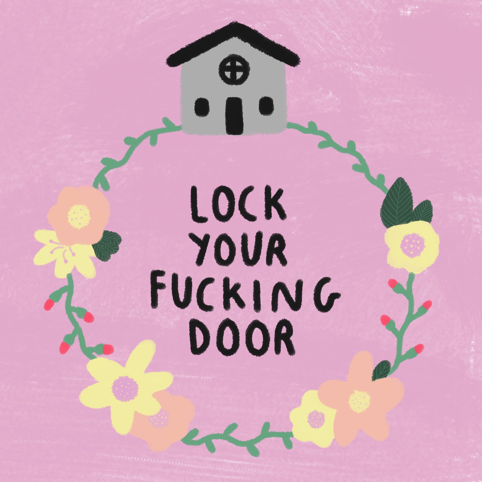
I tried out some of my existing images on some different background colours in photoshop and I'm really happy with the first result. I think the pink background works so much better with this image, it helps the flowers and writing stand out more and achieves that juxtaposition effect I wanted more.
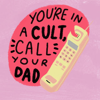
The second one made me realise this image works much better on a yellow, pale background as it helps the pink writing stand out more. Thinking about it now I don't know that any of the images would have looked good with the orange background.
This morning I had a tiny bit of a crisis about wether or not my final images were any good. I went from thinking I was nearly finished with them to realising that I actually hated looking at them and thought they looked really tacky. I spoke to Theresa and we decided I should try putting the images onto square backgrounds as before there was a lot of wasted space, and use a brighter coloured background as the grey one made everything pretty hard to see.
These are what I came up with!
Good points:
- the compositions look more considered and therefore interesting
- the bright coloured backgrounds make all the information easier to see and understand
- they also amplify the juxtaposition of the style of the image and the quotes
- they look more kitsch now whereas before I think they did just look tacky! I wanted them to look slightly kitschy as the podcast features some retro themes and I think that pairs well
- these just communicate what I wanted to get across better
Points to improve on:
- I'm still not 100% on the composition of the first or third images, I think they could be slightly reworked, maybe the first one is too small? looks a bit lost on the page
- maybe it needs something in the background or to be on a different background?
- and I don't know that the second one looks good with and orange background, I personally think it looks a bit insipid
Possible applications of my designs:
smaller priced items:
- badges
- pins
- stickers
- phone cases
- key rings- especially the "Lock your fucking doors" one!!!
- postcards- make a postcard pack?
- greetings cards
larger priced items:
- tote bags
- t-shirts
- posters/ prints
Had a bit more success with these today! I began by making the "Lock your fucking door" one based on a sketch from my sketchbook. This was my first and I think best idea, it incorporates the softness of the flowers and the creepiness of the lone house. But the colour palette and quote juxtaposed achieve exactly what I wanted to do with this project. I need to remember above all that the look I'm going for is black humour.
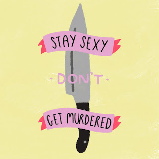
I really like the second and fourth designs, particularly the vignette style placement of the images on the grey background as this will in the future make it easier for me to place these vignettes onto merchandise. I'm just not too sure about the knife one, it looks . little simple and lack-lustre next to the others!
Today I began digitalising the ink drawings I'd done in my sketchbook on photoshop. These were all made using a graphics tab and pen which I will definitely be using more of in the future as it gives me so much hand control for doing hand lettering and drawing digitally. I like the second and fourth outcomes but I think the other two look really flat, I was expecting this to be the case as the more simple designs have more texture when made using ink which doesn't translate well digitally.
I think next I'll try working with a limited colour palette and using soft floral colours and more texture. In my crit today we spoke about how the idea of this project is a kind of black humour and this monochrome colour palette doesn't show much of that personality. I'd like to play more on the darkness of the subject matter and the humour of the quotes, whilst still representing this visually.