Tuesday 29 November 2016

Collage Task

Today we did a collage task in our CP groups which I really enjoyed. I love collage anyway but we had to go to the library to find one motif that related to our theme (mines american wrestlers) and then make multiples of it to use in any kind of collaged image we wanted. I started off by using an image of Joe Louis I found in an Americana book, and I just photocopied it loads of times. I didn't really know what I was going to do with it at first but then when I'd cut them all out and had them on my desk splayed out, Matt suggested I photocopied them into different arrangements. 


This was one of my favourite outcomes. Although its really not something I would usually do, I really like how simple this method is, I was going to add some hand stitching or some colours but I don't really think it needs it. I know I've said it a lot in these blogs but its so amazing how effective the more simple work is, and I'm just starting to realise that if the image is powerful enough then it doesn't always need a lot of detail. 


Having just said that I didn't think they need colour, I did add some graphic crayon lines to this variation on one of the prints. Again so not something I would do but I thought it suited the graphic theme and black and white colouring of the image. 


Lastly I did this one, just for the comic relief. 

What I've learnt:
- How quick and easy but effective photocopying be
- Simple is better
- Collage doesn't always have to be a finished collection of things on a piece of paper. It can use digital elements or repeated motifs.

Field-trip Planning

Today I did a bit of research into haunted places in and around with Leeds and so far York has stood out as a great place to go. The city has been described as one of the most haunted places in the UK, if not Europe and most of the supposed hot-spots are open to the public as well which is ace. My plan so far is:

- The York minster
- York Museum
- 35 Stonegate
-The Treasurers House
- York Dungeons
- Maybe a ghost walk?
- Lunch at either Ye Olde Star Inne, or The Golden Fleece

I'm also planning to ask around at these locations to see if anyone else has any cool stories that they can tell me, or any more information about the ghostly folklore around York. Theres also a book shop that I came across last time I was in York that I'm pretty sure had some paranormal books in it so I'll also pop back there.

Monday 28 November 2016

Tell An Untold Story Briefing

Today we had our briefing for our next task in the visual skills module. Were going to be doing a few weeks of research with a view to making our research into a picture book. 

My theme:
I was given the choice of the themes of evolution, consumption and folklore and after much consideration I chose folklore because although I thought a lot of people might be doing int, I could put my own spin on it
Starting ideas:
At first I was going to go just with the idea of traditional folklore told in small towns like the werewolf that supposedly terrorises Beverly called Old Stinker  and I still might go with this if I can find enough interesting local stories, but talking to Camilla in my class made me really excited about the idea of ghosts. This would technically still count as folklore as thats defined as a story passed down through generations of people through word of mouth. I began thinking about the large amounts of people that I know of that had some kind of ghost experience to share and wondered if it might be a good idea to ask a few more people if they had any stories to tell. Almost everyone I asked either had a story or had one from someone they knew
Field trip ideas:
My initial thoughts are that I should go to do research in York as I know its supposedly one of the UK's most haunted places and its also very historical so surely people there would have a lot of tales to tell. Tomorrow I'm going to put together a list of places to visit whilst I'm there and see if theres anyone I could speak to about their experiences. 

Finishing The Screenprint


On Friday we finished our collaborative screen print during our print room induction:

What I learnt:
- The process of screen printing (although I'd already learnt a bit at Vernon Street, I'd just forgotten most of it)
- I really really like screen printing, and I can definitely see myself doing it more on my own in the future, I just need to practice it a bit more
- That chunky images and thick lines look most effective on screen prints, or maybe a mix of thick and thin, rather than just all thin lines like we used
- Chinograph is a great way to achieve great, hand-drawn looking line qualities in a screen print

What could have gone better:

- The design of the screen print was great in practice but when we can to apply it I thought it looked a bit lifeless as we intended it in the middle of the page. I preferred the prints where we repeated the mark making layer across the page

- The colours could have been kept separate more as the blue and pink were great individually but mixed to make a purple which wasn't awful but wasn't what we intended.
Layer 1

Layer 2


Intended outcome

Design after the colours had become mixed


Favourite experimental outcome

Another experimental outcome

Wednesday 23 November 2016

Second Print Layer

Today we finished our second layer to be screen printed. All we did for this layer was make marks inspired by the sound maps we made during our research, but they've turned out really well in my opinion. We used a mixture of fine-liner, chinagraph pencil and ink to make the marks and I was really pleased with the line qualities as its something I'd never normally do. Ready to print on Friday.


Tuesday 22 November 2016

Screen Print Planning

After yesterdays grim rainy day, today felt so much better and I think we got a lot more done. After we had our print room tour we went into our groups to try and come up with a plan for our print. We came up with the idea of basing our image around the shape of a foot-print, and have all the materials I'd collected around the feet as if they'd been left on the floor. This was the initial sketch of that idea:


After we'd decided to go with this idea we made footprints on paper outside and then photocopied them to make them grey scale. We traced the patterns of these on to the clear plastic stuff using chinagraph pencil, this looked ace because you could see all the pencil lines. Then we added the photocopied leaves and receipts and drew on some puddles. 


This was our outcome, we're going to do more work to it tomorrow, then start working on our second sheet which will be a noise map made using different mark making techniques. I'm really excited for it, I'm also really going to try and pay close attention to how to use the print room as last year I only used it once and I'd like to challenge myself to feel more comfortable using it.


Monday 21 November 2016

Visual Narratives Briefing (RAIN)

Today we had our module briefing for the visual narrative briefing which was SO exciting. It sounds like something I'm going to really enjoy as I love telling stories in any capacity, especially through my work. For this first week we were told we would be learning about research.

Todays task:
We got put into a group of 4 and were sent out into Leeds to do research on the city and record anything we saw, heard, smelt, etc in anyway we could think of. Me and my group went all round Leeds (the long way, oops) to places like the Corn Exchange, the market, and the Light centre. We recored sounds via mark making in our books, I also got some video and voice recordings and we did some sketches from the things we saw. 

These were some of my favourite outcomes:


My recorded map of our route on the left and an index of shorthand marks to indicate different sounds on the right

A very tasty bagel
1st sketch inside the Corn Exchange done in pencil
Although today was really rainy and cold, it was so exciting to go around the city and just see what we saw, its reminded me I need to take some time to just sit and look at whats around me every now and then. Now were going to refine our research and do a screen print as a group, thats after we've been inducted into the print room tomorrow which I'm so excited for.

Saturday 12 November 2016

End Of Module Evaluation

This journey started with the Typology poster project which immediately struck fear into my heart as I didn’t even know what a typology poster was, but once I’d found out they were similar to the Birds of Britain posters I was all for it. This brief in particular that as a challenge as I’ve never really drawn people, I felt like I was rubbish at it and that it wasn’t worth bothering but something changed during this brief, maybe it was all the talent sitting around me or maybe it was that I REALLY worry about trying to look like I know what I’m doing. But either way I found an ok way of characterising all the people, and then found a nice way of drawing them with pro-marker and I was happy. 

So definitely got off to a good start, but then we were given the Illumination briefing which sounded so up my street until I was given a very depressing article my George Monbiot about how technology is making us lonely and will be the death of us all (sigh). At first I really struggled to pick out any imagery in it as I felt so blinded by the sensationalist nature of it all, but after I got over that it was actually quite an enjoyable process. I liked the systematic approach of going through the text, finding imagery or a sentence that appealed to imagination and then sketching based on just that. Doing this project based mainly on a piece of someone elses writing also made me realise, its ok not to agree 100% with the thing that you’re asked to illustrate, you can still make some nice imagery out of something you wouldn't personally say. This brief also bought me back to using collage which is one of my favourite media to use, but did also encourage me into using it in a newly simplistic way. I realised through this how much I can tend to overcomplicate things and how effectively a story can be told with just the bare minimum in shapes and line.

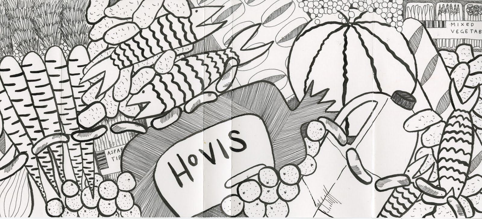
The final brief was the was the Judge a Book by its cover one which I’d originally thought would be the one where I could excel at… turns out I’m not as good at book covers as I’d thought as this one really challenged me. What really threw me off was not being able to pick the book we would be illustrating the jacket of, which is not something I’ve ever done before. It meant going into it completely blind and as there was no time to read the whole thing I ended up getting really into the authors Ted Talks, just reading the bits of the book that sounded most relevant and crossing fingers for a miracle. Fortunately I got quite inspired by the images inside the book taken by the author of the masses of thrown away product outside supermarkets and the volume at which things were being thrown away. For this project I really tried to push myself not to only rely on analogue media as I know I can be such a technophobe. I ventured onto photoshop to change some of the elements of the cover and add text to make it look more professional which is something give not done in ages but was really happy with the outcome. 


Something else I’ve really surprised myself with is how much I’ve appreciated blogging and what it can do to help with my practice. For someone that would usually take pride in doing a meticulously detailed and ‘pretty’ artists research page or evaluations in my sketchbook, its pushed me to not make everything look forced and perfect and just to get it down before I forget it. Its been good to keep as almost some sort of diary of my work as well and has helped me to stay out of my own head. I think what I’m trying to say is that although the short and sweet nature of these briefs frustrated me at first, I can now see that they were designed to encourage us to work and think fast, and to push us out of our comfort zones. And to be honest it really worked for making me more adventurous and playful. No longer do I care about my sketchbooks looking messy (much), AND I even used a computer. So even if I’ve not done the best technically, I’ve pushed myself to do things that were’t even on my radar in foundation, and for that I’m really happy.

Friday 11 November 2016

THE DEED IS DONE

THE BOOK COVER HAS FINALLY BEEN FINISHED...and I'm actually really happy with it. The whole printing process and folding it and cutting it to fit my book was a little stressful and probably a process that I need to work on. But its turned out pretty well (apart from the label on the spine being a little too big, but that's probably partly just me being picky).

From this brief I've definitely learnt the value of being patient on Photoshop and that it can really give you some great results if you just keep plugging away at it. This has really pushed me to stop being afraid of using methods I'm not used to rather than just sticking with what I know I'm good at, because if I just keep doing that, I'm not sure I'll ever improve. Its also really hit it home that sometimes the best ideas can be the simple ones, and the value of the line quality can do SO much to make something look more polished. I didn't even know what a line quality was a few weeks ago and now I can't do a drawing without considering it which is ace. 

Sorry that got a bit emotional there, its been a long and painful session on the computer and my eyes hurt. Anyway, heres some pictures of my finished book jacket. OUIL304, you've been bloody stressful, but pretty great.


Photoshop Hell

Today I began the long and terrifying process of scanning my finished cover onto the computer (by the way I finished my cover). Then played around with the colour of the background and lines. 

Heres how my cover started out:


Literally can you believe I actually made this with my actual hands?!?!?!?!?
I'm chuffed.

Then I added the colour I'd decided on, a nice burnt orange colour which me and my flatmates agreed connoted waste and rubbish. At first I only added the colour to the original black line drawing, but after some consideration I actually thought this looked too graphic.


So I fiddled around (for WAY too long) on photoshop to try and work out how to change this black lines to white as I thought this would look less harsh and wouldn't look as chaotic with text layered over the top.


Much better. Then I decided what colour and thickness of text looked best on the cover which was all worked out with printouts in my sketchbook. I decided on the Kefa font on Photoshop in a thick weight and in a slightly off grey colour. 

*Pause for a break whilst I figured out how to print it to fit my MASSIVE book.*

Wednesday 9 November 2016

I'M SO TIRED

Final design 


Today has literally been so exhausting, and I've only managed to fill three pages in my sketchbook. I've just been trying to finalise the image that will cover the book, which was SO much more fiddly than I'd imagined. I decided from mine and others opinions to use Indian ink and a thin paint brush to get a tapered and very hand-drawn effect, and then add some detail with a cartridge pen. 

The outcome has worked so well in my opinion and looks really striking, its so different to anything I'd usually do but I'm going to scan it in to change the background colours to make the whole thing look a bit more vibrant and finished. Not sure what colour would be best suited to a book about waste but I will find out now:

All my flatmates said brown or earthy colours so I'll look into that. I also need to think about what text to put on the cover and spine.

First experiment with drawing materials

My first two attempts

Tuesday 8 November 2016

Shape and Texture

Today we focused on shape and texture, more specifically, simplifying shapes to still try and convey an obvious symbol. We started this off by thinking of our favourite fruit of vegetable and try to make it out of paper cut as simply but effectively as possible. I really enjoyed this although it was very far out of my comfort zone to make this simple an image (I had to keep reminding myself to not add any shading), however I always enjoy paper cutting. These were my results:


I was actually so happy with the results, these are my favourite three but I actually made 7. The best ones really were the simple ones and the graphic shapes and minimal use of colour are definitely something I could see myself carrying through into other projects.

We then used the same principles we'd learnt in the morning to make a self portrait. For this we could use any colours and textures we wanted and mine ended up feeling really autumnal because of all the browns I used (but really that was just the only paper colour left over, maybe no one else wanted it?)


This was the final outcome which I was pretty happy with. I've really surprised myself with how free I felt during this project, allowing myself to just cut straight onto the paper without marking too much out before hand has made the work look much more organic and given it a personality. 

What will I take from this into my future practice?
From this I have learnt that if I simplify my images, the sky will not fall and it might even still look nice! In future I'll try to simplify shapes and not add a fine-liner outline to everything I make as this can clearly be replicated using just cut shapes and playing with the way they interact on the page.

Monday 7 November 2016

Book Cover Idea Feedback


Feeling positive :) excited but scared to start experimenting with this brief. 

Thursday 3 November 2016

Judge A Book By Its Cover

Today we were briefed on our new Visual Skills project which is to illustrate a new book jacket for a random book we chose from the library. The one I picked up was called Waste by Tristram Stuart, and the idea of the book is to highlight the ways in which people waste food and what ideas we can put in place to stop this happening. 

Here are my preliminary sketches for the jacket:


From this I refined my ideas into these mockups using newsprint. I've only gone for the designs that wrap the whole way across the cover as I thought it looked too boring with a smaller image. At the moment this one is my favourite, it shows the mouldy vegetables on the front and as the viewer finishes and closes the book you can see that at the back the vegetables aren't mouldy at all. This one is the most effective in my opinion I just don't know how realistic the mould looks.

Tuesday 1 November 2016

Line, Tone, Mark and Pattern

Today we looked more at using mark making to create functioning marks and how we can then use those to incorporate patterns, tones and textures. Our first task was to depict contrasting words using mark making as simply as we could, these were some of my best results-


Why I think these were so successful:

These were the ones I felt communicated the idea of the words with the fewest lines which is my aim in life basically, to simplify my work. I think I could also see them working as functional images as the first one would make a good pattern on drawn clothing and the last ones remind me off animal fur or a grass texture.

Second task:

After this we had to use our newly made marks to put together a large image of our 'Dream Home'. After sketching out a few designs I decided to go forward with the dragon house one as I think it had the most personality and had lots of good opportunity for textures. Although this was more time consuming than I thought it would be (and as usual I made things WAY more complicated by choosing fiddly shapes for the collage cutouts) I think it went ok. I got a fair few textures in there which now I can really start to see the benefit of using as it gave the character a bit more depth and interest to what would have usually been a large amount of blank space.

In conclusion:
I think this activity has reminded me that I need to make more of an effort to employ more sophisticated line qualities in my work and that making a sheet of textured marks to then cut up and use for collage later is a REALLY good way of working.