Tuesday 28 March 2017

Evaluation

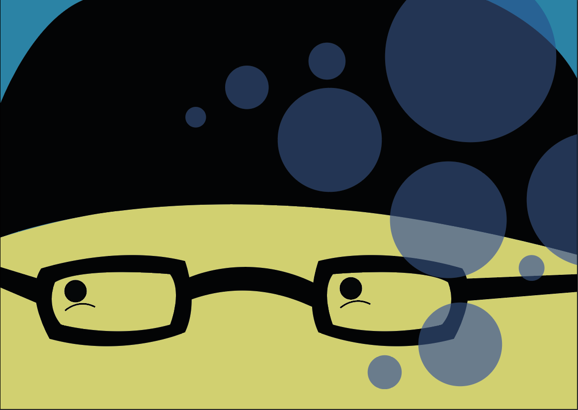
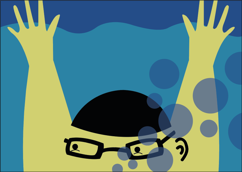
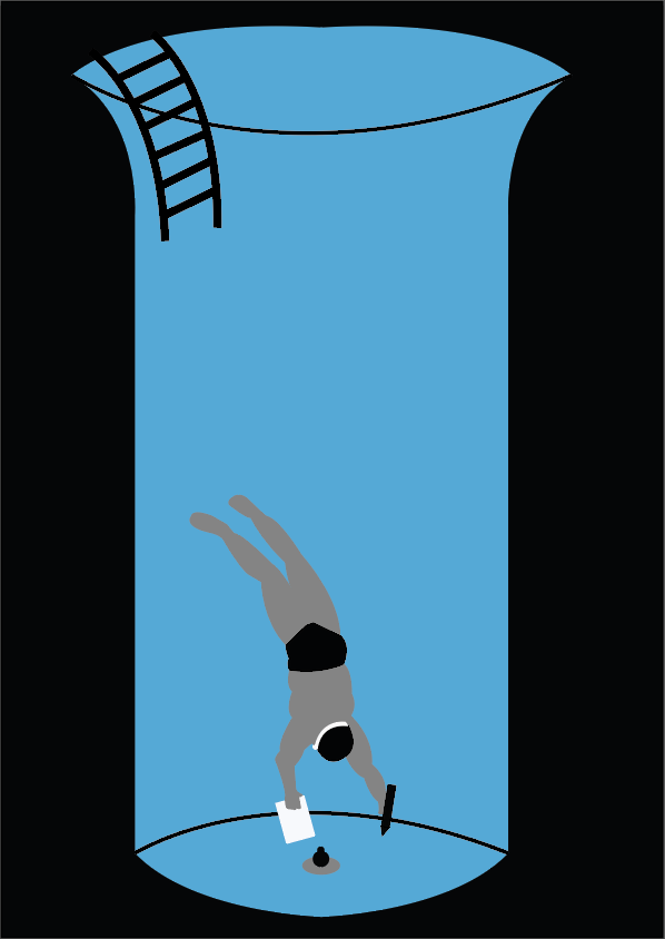
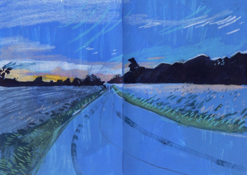
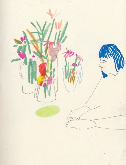
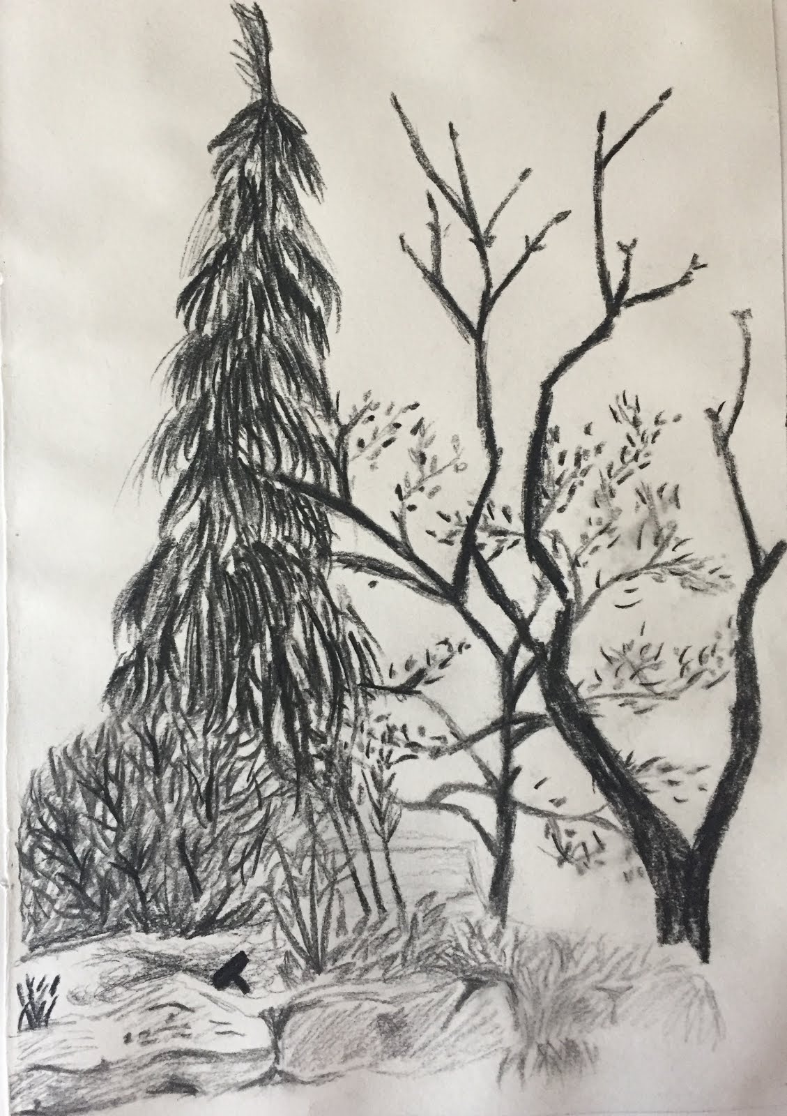
This module has most definitely had its ups and downs but I can safely say that its been my favourite of the year. The beginning saw us getting stuck into character design which was something that I thought I was already well practised at, but the fact we were given a random song we had to relate the character to made it that much more challenging. I was given a song called ‘Please’ by Blanck Mass which was really not something I’d ordinarily listen too, but I still really enjoyed just taking time to sit and listen to the little parts and pick it apart to try and find a character in there. I ended up making my character a space yeti called Richardo who I have become way too attached too over the last few months, one of the hightlights of this project was the amount of time we were allowed just to get to think our characters personality through and get to know them. I feel like this really helped me when it came to animating the way he would move. Before this module GIFs were an alien and terrifying concept to me, which I’d seen but had no clue how they even worked, but I went in a little bit too determined to learn something new as I feel like I’ve been lazy and stuck my head in the sand before when its come to learning new digital things. Now I can see what a valuable skill this is too have and I 100% think that I’ll be making more GIFs in the future as they really helped make my character that extra bit more three dimensional. They can still be a little bit frustrating because I think they need more accuracy and attention to detail than just drawing but now I know the process its a lot less scary. I also started to feel like a lot more of my personality was coming out in my character designs and especially in Ricardo. 

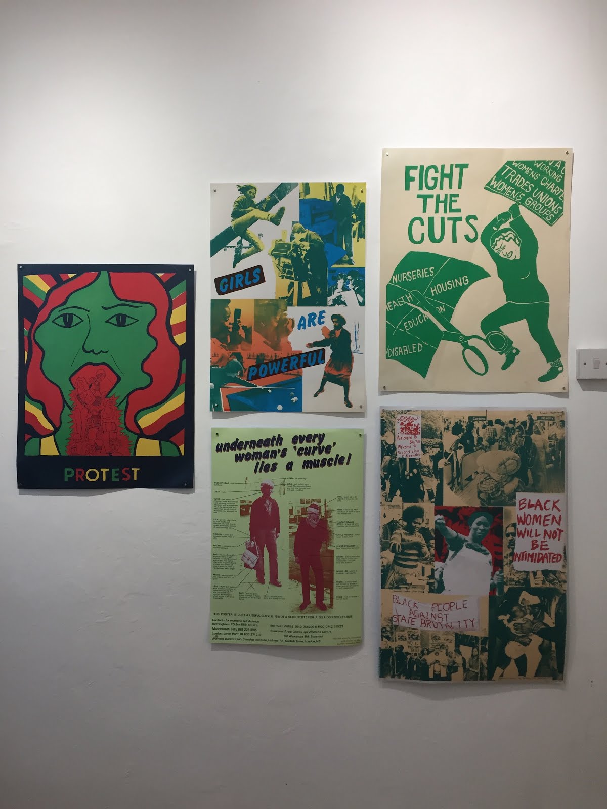
The sticker brief of the project was my favourite, even if it was daunting at first. The brainstorming and roughing part of this brief was some of the best times I think I’ve had on this course so far as it really made me realise how many things I care about and how I can use illustration as a platform to talk about those things and make them visual so that they can be understood by more people. I ended up going with a few ideas centred around catcalls, body positivity and not being a dick, all of which I talk very passionately about. Making the final sticker on Adobe Illustrator is something I’ve never done before but thought I’d really struggle with as I often find it hard to see the logic in digital processes, however learning how to use Ai in this module has literally changed my practise for good. I don't know why I feel so differently about Ai than I do about photoshop, maybe its using vectors or the freedom you can have with it? Either way I find it so satisfying and simple to use and I think I’m using it well enough now that you still get a sense of my hand of the maker through it, it still looks like something that was made by me. We also had to stick to a two colour palette for the stickers which is something that at first I used to really struggle with but now I can see that it helps to give the work more of a focus and look a bit more professional. I made my stickers black and purple and ended up going with the body positivity theme, it was during this brief that I realised I could see myself making things like this for real in the future.


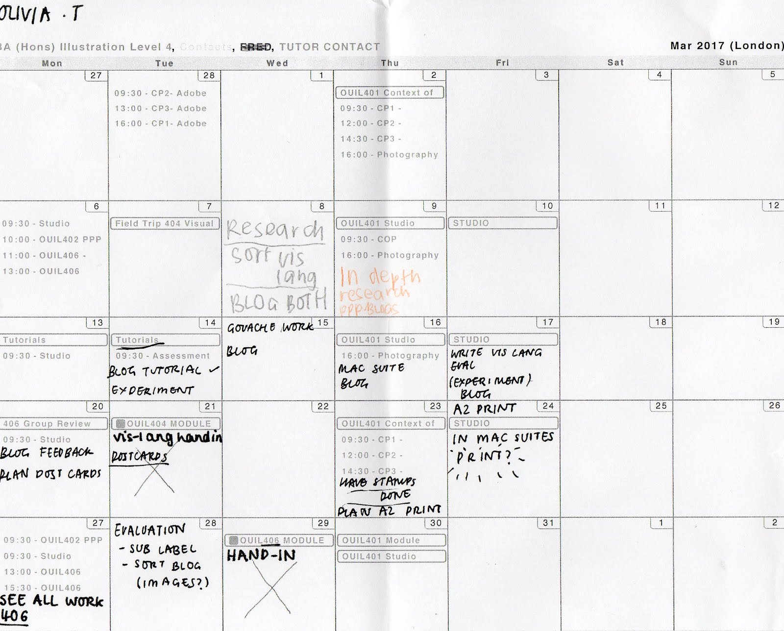
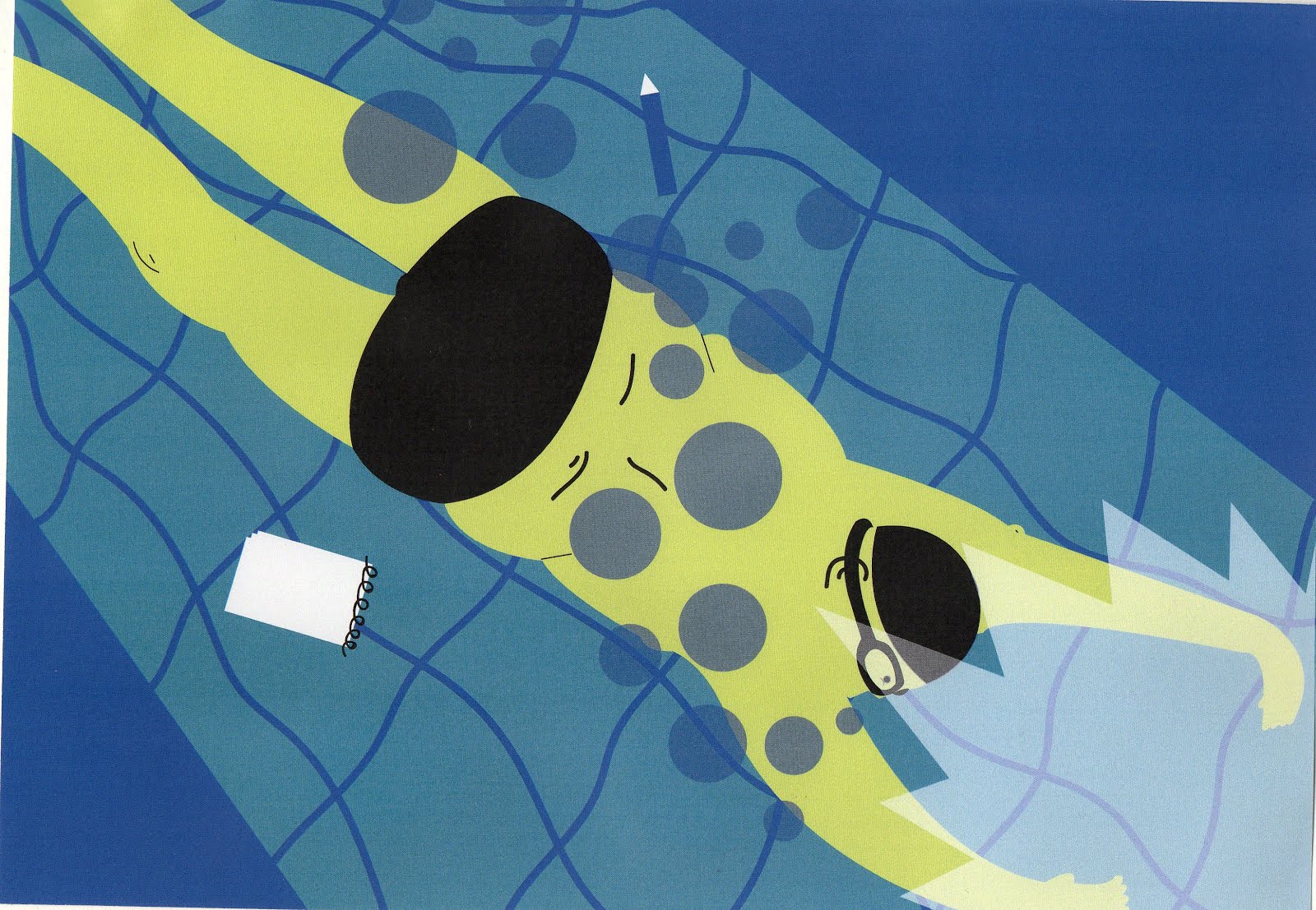
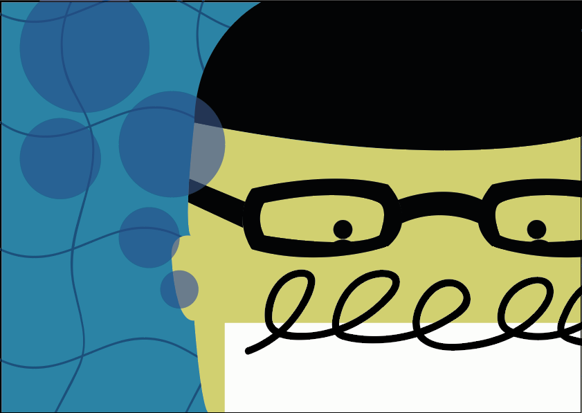
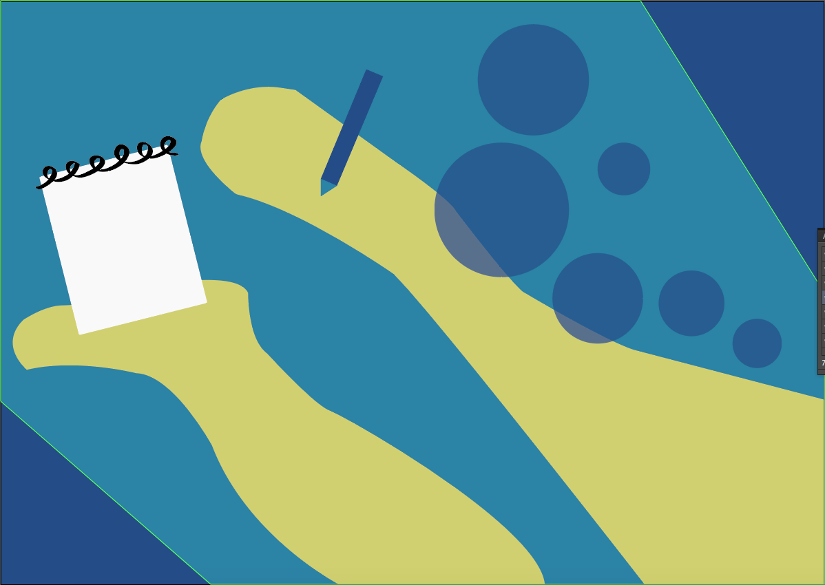
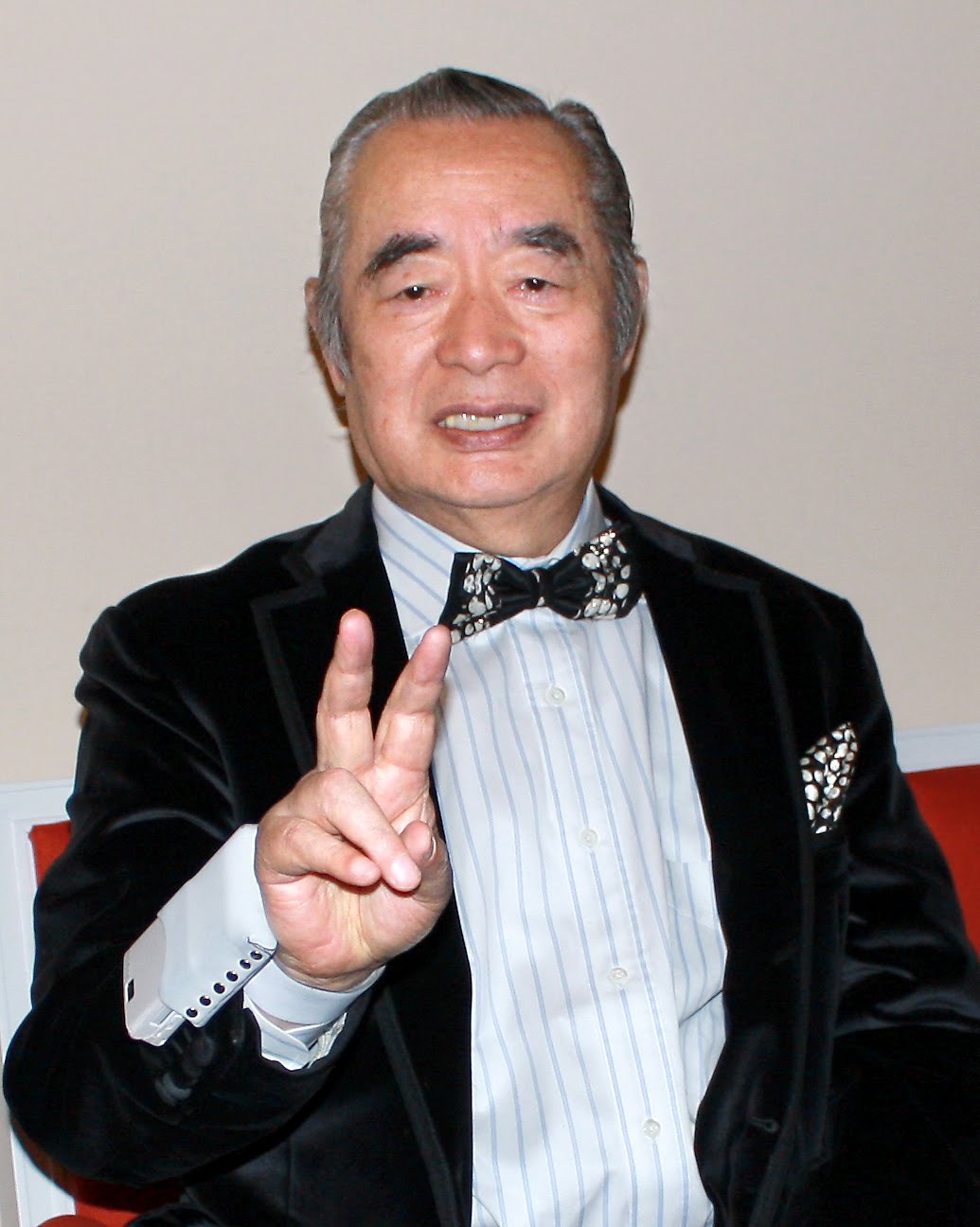
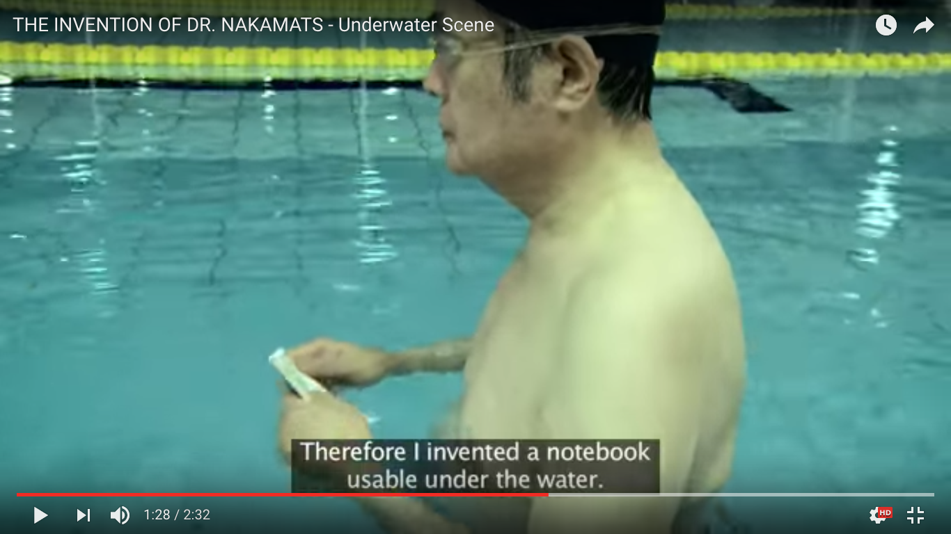
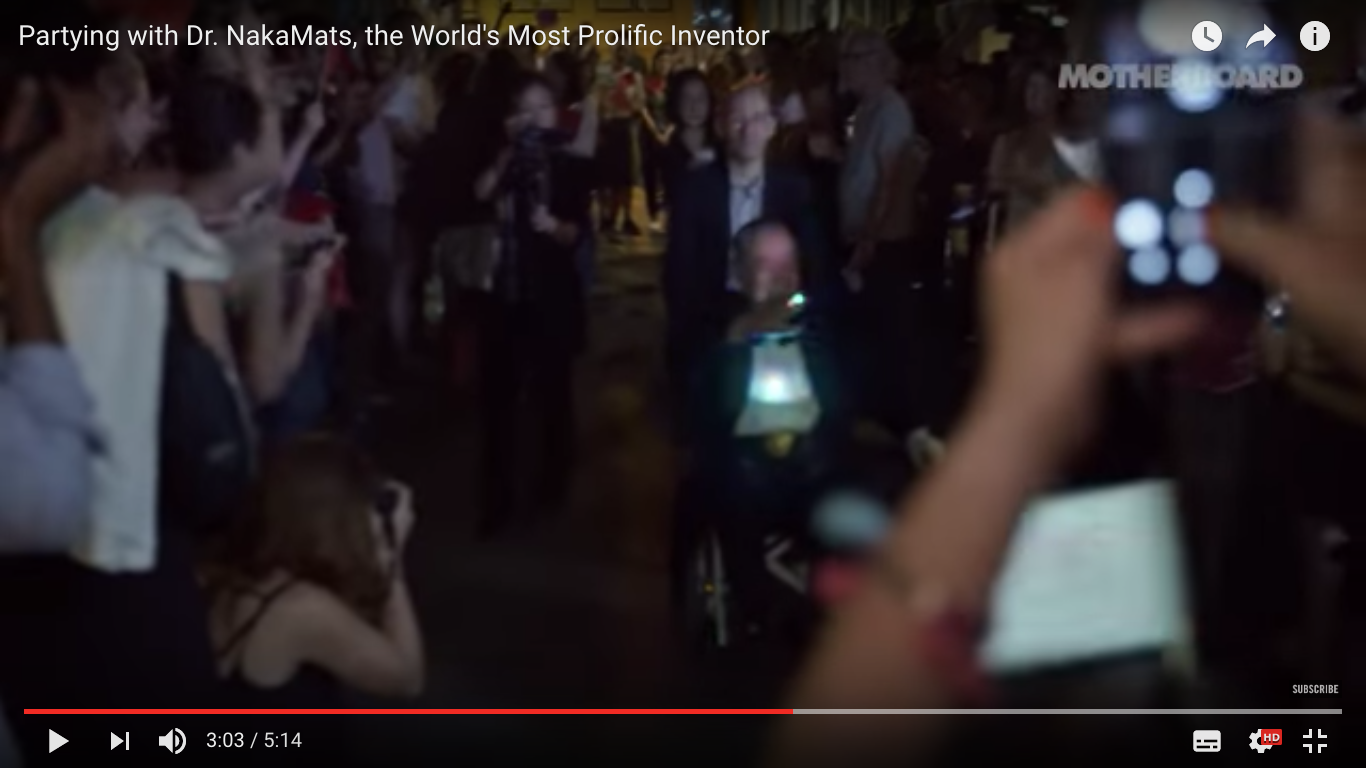
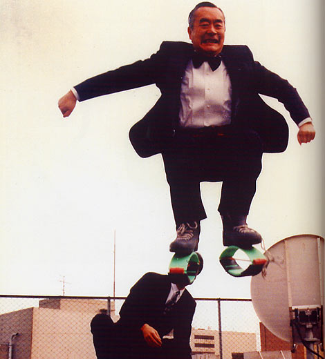
The final brief was defiantly the hardest and I don't just think it was because it was nearing the end of term. I did mine on Yoshiro Nakamatsu, a Japanese inventor and all round crazy person, who I’ve really come to love. But at first I found the research element to the project really hard, even though I’m someone who has always thought I’m quite good at doing extensive research. I think the reason I disliked this brief so much at first was that it felt eerily similar to visual narratives which was really challenging and was mostly self led, and compared to the first two briefs of this project which has been quite restrictive and had a clear direction it all felt really daunting. Its not that I don't like choosing how I lead the project, I really like deciding which parts I’ll choose to focus on and which media and colours to use, its just that in a project like this one where we only had three weeks to research, develop and make, it felt like we had to make a lot of decisions in not a lot of time, and in that situation I’m always scared I’ll focus on something rubbish then only realise when its too late to change it. Luckily we had a lot of crits and feedback sessions which I found immensely helpful, I think when I spend too much time with a project my head becomes a bit cloudy and I struggle to see if what I’m making is any good. I started by playing around with gouache and whilst I was really enjoying the process it felt pretty tedious having used more digital methods for the last few projects. I struggled to come to terms with this change in myself during crits and on my blog, as a lot of people seemed to really like the use of wet media, I just wasn't enjoying making things with it. So I decided to start translating some of the sketches I’d worked up into Ai, this took a while at first and the first few looked horrendous, but after a few goes I found my feet, and felt I was able to put my own spin on the process and make it look my own. I did really enjoy portraying Nakamats in this way
even if I found it hard at first, I think what I’ve learnt from this is that in a similar way to narratives, I need to focus on smaller areas of information during research, and to make what I enjoy creating, because overall thats what I’ll be motivated enough to continue with and learn the most from. 

Overall this has been the module where I have begun to feel most like a real illustrator and there are so many reasons for this such as the sheer amount of hours I worked on the things I was creating, I was working from 9 to 6 every day and feeling really great about it because I could rest easy knowing that I’d put all the effort I could into it, but also it was easy because I was enjoying it. Theres also the fact that I got to put a lot more of myself into the briefs, which I have come to learn from this and the other briefs isn’t a bad thing. Its driven me to be more passionate and involved in the process, as well as more in touch with myself and how my practise makes me feel. Its also led to me finding out how to use some valuable processes which I know I’ll use again, without this brief I might not have found out how to use Ai, and although I know I cant rely on it for everything, I think it has greatly helped me in simplifying my practise where I used to needlessly over-complicate things. I’m leaving this module behind, feeling both sad and relieved that its over, but excited to put more of myself into my practise and get stuck into the next project as much as I have into this one.

Note To Self: TIMETABLE EVERYTHING


Was writing my evaluation and I realised that even though I slipped up a few times like with being a bit tight for time in the last week of this brief, this was the first module I'd properly timetabled and I think you can really tell. Its payed off as I've finished now and feel so much more relaxed about it because I can see that I have everything done, why don't I do this more often? (cause I'm lazy)

Saturday 25 March 2017

IMPROVEMENTS

After finishing the A2 print I realised there was a few improvements I could make to the postcards so they looked more like they were actually part of a series. 


All I really did was add a few more of the wiggly pool lines to the postcards, I think its made then look a bit more dynamic and hopefully makes them look a bit more related to the A2 postcards and stamps. I also changed the image on the right so that it didn't look like Nakamats was under the sea as I realised that it didn't really make sense and I also preferred the 'V' shape of the other images.

Sir Dr's Finished Posters

Today I've been in the mac suite making the images that will be printed out at A2 to become my poster, I did so many roughs in my book because I literally had no idea what I wanted my A2 poster to be. At first I thought it would be something similar to the first image I did of Nakamats diving in that test tube shaped pool as I did really like the composition of that in the beginning, but when I started thinking more things through I realised there was so many more dynamic composition ideas that communicated the idea of him struggling to hold his breath more and the first one just didn't really show any of that. So these are the two that I've made:


Good points:

  • I really like the composition of this one, a lot. I like that it means that you can see his full body and the little pair of speedos he would wear whilst diving, and I think the larger image frame gives you more of an impression that he is fully underwater, and how opressive that is
  • The colours on this and the others have turned out really well, for some reason I find it so much easier to work within a confined colour palette in Ai than with analogue media? 
  • This one is also quite good at leading you into the picture, I feel like your line of sight is drawn first to the figure, then down where the bubbles lead and then to the white explosion of light, so in a sense you kind of follow Nakamats down on his dive

Bad points:

  • His left hand makes me laugh a little bit... not sure what happened there or why it looks like a fin, but thats ok? 


Good Points:

  • I think this one really captures the expression of running out of air/ panic on his face, I think its partly down to his eyes and the bubbles where his mouth would be but I really like that. 
  • This one is more closely cropped but I think that also helps with portraying the expression on his face, as it means you can see it in more detail
Bad points:
  • I don't know if this one is too closely cropped, maybe it looks a bit too much like the postcards? Its the same kind of format just in a bit more detail and I don't know if thats interesting enough for the poster format
  • I don't like that we can't see his full body in this one


Conclusion?: 
  • I think I'll probably end up printing the first one at A2, although I like them both I think the first one is a bit more dynamic and interesting, its also the only one where we can see his body in full so it gives you a bit more of a sense of what he was like as a person


Thursday 23 March 2017

Stamps!!!!!!!!

Finished my stamps today! I ended up just going with making tiny little zoomed in sections of the objects that we see Nakamats wearing/using underwater on Ai. Now I'm looking at these I know these might not have been the most clever idea I've ever had, but I think that sums up this project for me, I'm nearly through it and I've made some OK work but I wouldn't say any of it is the kind of work I could see myself seriously making for myself or in the future?


Good points:
  • They are really in keeping with the rest of the things I've made for this module and theres a really distinctive visual style with them all
  • I think they tell the story of Nakamats's underwater creative process quite well? These are the fundamental elements of his thought process and all play a part behind his inventions so I guess they're quite important to this project
  • I shockingly really liked working to this size, especially on Ai because you can work at a normal scale and the scale it down when you're printing it. Theres no way I could have got this precise detail using analogue methods at this size, it would have been way too fiddly! 
  • I've also found the process of working digitally really satisfying in that it makes it easy to make a lot of work really quickly that looks really high quality, it also makes it really easy to make changes to work you've already done if you change your mind about it (something I'm thinking about with my postcard designs)

Bad points:
  • As I said before I am fully aware this isn't my most developed work and there maybe isn't much of a story behind this? But thats due to me managing my time quite badly and running out of time to generate any more ideas
  • I don't know if I've done as much as I could have with the frame of the stamps? maybe I could have filled the frame more and played with composition a bit more


Wednesday 22 March 2017

Breakthrough?

I've spent the whole of today in the mac suites plugging away at my postcard designs and making them look... not so shit. 

So far this is what I've come up with:


I'm still not 100% on all of them and I'll most likely hate them by tomorrow but for now I'm pretty chuffed with them.

Whats gone well:
  • The colour scheme is pretty damn good in my opinion, the yellow and blues look really sharp and dynamic, and the black detail helps to outline the basics of what Nakamats looks like whilst he'd diving
  • The media fits the purpose of the illustration really well, because its all been done digitally, not only have I ended up with beautiful clean lines but I was also able to make some of the details slightly more translucent to convey that sense of being underwater
  • I think (hope) that these are more evocative than what I was making before, partly down to the colour scheme but also the jagged shapes that you can create on Ai, also I've been trying to think a lot more of composition in these last few drawings which I think can be the difference between something look flat and unrealistic like the first few Ai drawings I did to looking more dynamic like these
What I need to do now:

  • Now I need to put my efforts into making the stamps and the poster which I really don't have a clue what I'm doing for, but I need to start brainstorming in my sketchbook
  • Decide whether to carry on with working digitally (I'm tempted, its quick and really satisfying and I think looks pretty effective for what I'm trying to show here) or to experiment with monoprinting? 


Tuesday 21 March 2017

Breakdown

I woke up this morning absolutley panicking about getting everything done on time for this submission next week because I realised that it wasn't just one piece of work that needed doing it was 8 and I really haven't prepared myself. So I started early and went on with what I'd been doing yesterday which was using gouache to paint Nakamats diving for ideas. I did one painting and realised that A) it had taken me about 2 hours to do, and B) I wasn't even that happy with the finished thing which was so disheartning. So i started roughing the ideas for my stamps and postcards just to kick my brain into gear a bit. I actually liked a few of the outcomes that I came up with during this little brainstorm so I went into the Mac suites and started trying to create it with Ai, this is what I got:


Obviously these are no where near complete but I think they're massively more interesting and dynamic than the paintings I'd been doing, AND it means I'd be using a material that I don't always use (unlike gouache). The composition of these is making me a bit happier so I'm going to go back into the studio tomorrow and keep working on these. I'm also going to see about going into the print room and trying to do some monoprints.


Monday 20 March 2017

I just want to be good at making pictures

What is successful?:

Immediacy, being able to understand and identify with something as soon as you see it. Whether this is through a really clever idea, or really striking visual style, or both? Simplicity usually seems to be a good way to achieve this? Also anything that makes you feel something is a success in my mind, whether you can look at it and feel a sense of the mood the person was trying to get across in that work is really important but hard to achieve, its something I'm really struggling with at the moment. 

What is great?

The thought process and consideration that go on behind work are what makes it great, anyone can make something that is technically good, but it takes experimentation with different methods, iterations, roughs and mistakes to actually learn whether what you're putting together is the best it can be. I guess a big part of what makes something look good is selecting the appropriate way to tell your story to best make the point you're trying to make

How is this project exceptional?

At the moment, I'm not feeling too much like its exceptional, which is really making me sad. But I know is largely down to my rubbish mood and feeling so overwhelmed, and it really is a shame because what makes this project so exceptional is that we get the opportunity to tell someone Else's life story through our work any way that we choose. And more than that the people we've been given are fascinating and theres a lot of really amazing information to be conveying in our images. Whilst I've been seeing this as a really scary thing as it means the pressures on to portray as much information as possible in a short amount of time, also doing it in the most effective way possible and do this person justice, I do need to start seeing it as exciting, because it is. And just like with visual narratives which started off so broad and overwhelming, I need to look at what I can do to narrow down my area of research so that I'm only trying to show one small aspect that makes up this mans life. In my head I'm worried that no ones going to understand the outcomes if they're not these all encompassing, complex masterpieces which is ridiculous because we can be as abstract as we like. As long as there is a sense of emotion and feeling that reflects this amazing man and his life in the work I produce then surely the work will have succeeded? I'm just not sure if thats the same thing as it being great.

Feedback session (negative moodiness)

Today we had a very long and very scary feedback session for the work we'd done so far, which in my case was not as much as I could have done simply because I've been so stuck on this project so far. 

What I learnt:

  • people really liked the analogue stuff that I'd done and didn't seem too fussed about the illustrator work, which is good because I also liked the way the analogue things looked and the general consensus seems to be that wet media works better to portray the feeling of being underwater
  • however, even though people seem to like the use of gouache, and I really enjoy using it too, I feel like I tried to push the boat out with the digital work and it still hasn't worked out? Anything I could do on Ai I feel like I could also do using analogue media if not do it better. Maybe I'm wrong but that's what it feels like at the moment and I'm worried it looks like I've not experimented at all and always play it safe using the same materials
  • the swimming pool idea has been a success and will 100% be the idea that I take forward, which is good because I've run out of time to think of trying much else
  • I need to be more specific, honing in on certain feelings I'm trying to evoke using an image and focusing on smaller scenes at once and in less detail. REMEMBER, things can be abstract

After the session I went home and just roughed up a lot more compositions of a similar thing I'd been doing before but focused on a smaller section of it. I wanted to show the feeling of desperation and near death state that Nakamats would be in, and the oppressiveness of being surrounded by water:


The second version is a bit better in my opinion as it actually looks more like him, the skin tone is better and the gestures stronger. I've realised its really hard to show someones reaching really determinedly underwater, none of the arm gestures look strong enough so that's something I need to work on tomorrow. But in terms of composition and process I'm chuffed with this, its a bit more evocative than the things I was doing before which is something I'm striving for. Tomorrow is a new day, and hopefully this will all be less of a struggle then, I'm going to go in to the studio and work more on making this image say something important, and maybe the rest of the brief will start to follow on from that? really not feeling too positive about this project. Maybe its because its close to the end of term and I'm mentally exhausted or maybe this topics too broad for my weird organised brain but I'm really finding it a struggle to make anything I like and think of as good illustration at the moment which is very disheartening. I think maybe I need to rest on it, think about what I'm trying to do with this project and then try again tomorrow? ahhhhhhhhhh help

Sunday 19 March 2017

Visual Language Evaluation

The beginning of this module was a rocky one as it began with a day of drawing on location, which is something that I had never really had to do before and therefore was something that I was dreading. I began the module thinking that I was no good at drawing on location, and couldn't see how it would help inform my practise at all since I’ve always been able to work from photos or just draw from my imagination. After that daunting start we then got stuck into picking a visual subject and portraying that in different ways relating to line, mark shape etc. Since my subject was one I was able to choose and it was American wrestlers I felt a lot more invested and engaged with the subject which in turn definitely made it easier to keep focused on, however this has made me realise that this is a fortunate and rare circumstance, and I wont always have the luxury of drawing something that interests me on a personal level, and if I’m going to be an illustrator I will have to make the best out of some bad subjects sometimes, I need to work on focusing harder on things and not just giving up. A lot of this part of the course made a good amount of sense to me,  in that we would have a seminar on tone for example, then we would do an exercise relating to tone, and then we’d be set work to draw our visual subject but in a way that dealt with tone so that we really understood what the lesson was on and how it could help inform our practise. I think that out of our visual language lessons I could then see the benefits of this creeping into my other work, as I started to experiment with different line qualities and ways of working, you can see that though process in my book cover from visual skills. 

The collage and ephemera part of the module was definitely one of my favourites as I really like collage anyway and have used it a lot before, I made some collages of my wrestlers in the early stages of the module that I still really like as images and will aim to look at using again. This part of the module was also really eye-opening for me as we looked at college in terms of using found images from books to make our own images rather than just using cut paper. I took an image of Joe Lewis that I found in an Americana book and just started scanning repeats of it on a photocopier and moving them around into different compositions. After I’d done it I wasn't sure it would count as the 10 sheets of collage work that we’d been set to do but when I found out it did I was shocked as I felt like I hadn't spent nearly enough time on it. I was even more shocked when a few people pointed it out as a good outcome of the brief as its so different to anything I would usually do but this did make me realise that things don't always have to be fussy or intricate to be a good image, and theres something about the immediacy of simplicity that can make the simplistic images some of the best. I felt a similar way after submitting our 3D lens work and seeing that whilst I’d spent way too long crafting tiny food to use in my image, others had just used one prop and taken a simple image and it looked just as good if not better. This really made me realise that it is in my nature to over-complicate things, and sometimes what I need to do is sketch something once, step back from it, see which bits I can take out and keep on taking things out until its as simple as it can be whilst still getting the message across effectively. 

The second half of the module was definitely where I started to see a massive improvement in my work and the thought process behind it, it was like all of a sudden the intent of the module just made so much more sense to me and I could start to put everything we were learning into action. One of the things that I think helped this was the hand-outs we started being given to annotate and talk about in class. Even though at first I found this extra bit of reading and writing pretty challenging to keep up with, talking about the principles of composition and frame out loud really helped to make sense of it all. Without realising I had been recognising these principles before, but not fully identifying what made then effective or not and certainly not applying them into my own work. In the last four tasks we were set in this project, I ended up a lot happier with the results and I can now see upon reflection that this was largely down to the difference in the way I was attacking the tasks when we were set them, suddenly I was able to identify what would make the most effective composition from the roughs that I’d made, I had a better understanding of depth and how to portray it on paper, and I understood and could deal with which parts of the image I wanted to make stand out and which could take a back seat. The two most successful pieces of work in my opinion from this part of the course were the elephant piece and the fan art poster, and this is because the principles we had been learning in the seminars had got me thinking more like an illustrator and therefore the things I was making were looking more considered and professional. 


The end of the module saw us going to York for a day of drawing on location, which obviously at the beginning of the course would have been my idea of hell and I might not have even turned up because I was so convinced I was rubbish at drawing, but through a whole module dedicated to drawing and observing I had gained much needed confidence in myself and the way I portray things. Although I know that drawing on location is still something I will find scary and difficult I know I can do it and I know that the only way I’ll get any better is just by doing it more and thinking and reflecting on it more. Having the blog has really helped me to make sense of the value of it in my head and start to relate it to how it can inform my own practise. Although at the beginning of the module you can see my confusion over the objective of the tasks we were doing, I think over time it becomes more obvious that I am learning things I didn't know before and starting to incorporate them into my work, both in this module and the others. Not only this but I am understanding and recognising that I am doing these things and recording that process on my blog so that in future I can look back and hopefully identify what makes something a success or not. Even though I haven't come out of this part of the course absolutely in love with drawing on location, it is something I can and will do as I can see it has a positive effect on my practise and I now enjoy it and that is something I could never have imagined a few months ago.

Thursday 16 March 2017

Illustrator Trials

Today I've mostly been in the mac suites trying to translate the drawings I did yesterday onto illustrator. This has proven pretty bloody hard, not even in terms of getting Illustrator to work, I think I've got that down now, its just getting things to actually look good compositionally that I'm struggling with. These are the final outcomes of today:


First attempt:
  • This was actually my favourite drawing I did yesterday so I was massively disappointed when I tried to trace it and THIS was the outcome. It looks so rubbish, but I guess it was the first try of today so maybe thats why it turned out so badly. 
  • I tried to experiment with the different thicknesses and line qualities you can use with the pen tool but now I'm looking at it thats actually just turned out quite tacky, maybe simple, more clean lines look better on Ai?
  • Also for this first try I didn't stick to any colour scheme which I think makes it look pretty messy


Second attempt:
  • After that absolute failure I tried the next drawing I'd done and surprisingly this turned out so much better! I think what worked here was the minimal composition to start with, with one very simple thing in the middle of the page it draws the focus in
  • I also was able to remind myself to take a lot of the detail out of this one as well which is something I've kept trying to replicate after watching the Netflix documentary on Christoph Niemann the other day. I didn't feel like this needed the pool lines the other one had or any of the smaller details because you can see from the wider angle that this one takes place in a pool, so it immediately makes sense
  • I also stuck to quite a simple colour scheme here which I think is something that translates much better on Ai than in paintings, it makes you focus less on the small detail and more on whats actually happening in the picture


Third attempt:

  • This is a massive improvement in my opinion, still not as good as I'd like but better. I got the hang of using the pen tool and the charcoal effect to make the drawings look a bit more organic, and I think the simple colour scheme makes this look so much better
  • Still not sure if its easy to understand whats going on here though, if it wasn't just me looking at this and you had no context I think it would be a struggle. 
  • I think maybe my next step in this kind of work is too look at how I can compose this image a bit better and also look at how I can effectively give the feeling of being underwater in these images? cause at the moment I'm thinking they look a bit flat 


Wednesday 15 March 2017

Gouache = God

Today I made a start on thinking through some of the swimming pool ideas in my sketchbook, and chose to start by using gouache which is something that I've really not used much before. I just did some simple ideas of what I imaged Nakamats must feel like when he's diving for ideas, also I really like the phrasing of that:

"Diving for ideas"

It sounds really ridiculous but that essentially the way he chooses to brainstorm his inventions. Like he's diving for treasure. Anyway the ideas I have so far are really simple but I've been trying to think more about composition and I think its paying off, the two ideas I've had so far are quite pleasing to look at. Also I had no idea how fun working with gouache was, I need to do it more often, I think I'm going to try to simplify the shapes I've used today tomorrow with paper cut but in future I'll be making an effort to go back to gouache.


Tuesday 14 March 2017

Tutorial


Had my tutorial for narratives today and I'm feeling SO much more positive about the subject and the project itself, I didn't realise before I started talking about it out loud but Sir Dr Nakamats is actually way more interesting a subject than I first thought, I actually think his philosophies and spirit resinates with me. 

What to do next:

  • I need to work out what I want to say about his legacy. Do I want to focus on his objects and the things that made up his life? Or do I want to focus more on the process he used to create those objects? Both are good but which one will I be able to focus on for longer?
  • Sketchbook both ideas and see which one gets me going more
  • Try and work out a way of experiment with using found objects in either or both subjects: floppy disks, swimming floats, old electrical equipment, goggles and anything else that reminds me of him
  • ALSO: in the style of Christoph Niemann, SIMPLIFY. I enjoyed using illustrator last time so maybe try that again? The only way my works ever going to look new and exciting is by using new ways of working and not being boring
  • GO SWIMMING! take a camera and get some first hand experience of how Nakamats would feel when he's inventing. (but try not to drown and maybe down wait until exactly 0.5 seconds away from death to come to the surface, could be risky)


Friday 10 March 2017

Charlotte Ager

Charlotte Ager is an illustrator that I've followed for a while on Instagram but has recently been interviewed by Its Nice That about her practise. She will be graduating from Kingston soon but is already really prolific and seems like she's churning out great new stuff everyday.

Successes of her work (theres so many):

  • she seems like a real grafter, constantly updating her social medias and her website, but also creating work for herself, commissions and her course. She seems to have some kind of way to balance the speed at which she's making these things and the precision she uses as well because its not like anything she's producing is mediocre. 
  • she is really brave and experimental in her practise and I think thats probably what keeps it so fresh and engaging. In the article she described her style of messy, because she's impatient so likes to get things down quickly, I think this means her work has a uniqueness to it first of all, it almost looks like she's looking at whatever she's drawing continuously and not ever looking at the paper, just trying to translate what she's seeing. Also I think its by doing this that she is able to capture the energy and the movement of people and places
  • her work is just so immersive, probably due to the reasons I've already mentioned, but when you look at her work you really feel like you're looking at something thats happening, or that you're there, its evocative and gives me that really weird feeling in the pit of my stomach (in a good way?). She says she also uses a lot of film and animation in her practise which makes sense, she does well at capturing things that are fleeting
  • the one image that stands out over all of them (and its hard to pick just one) is the one of the train going by on a bridge, the moment I saw this was the moment I knew she was the kind of illustrator I aspired to be. I love that notion of taking a scene so average and making it mysterious and romantic, through use of colours and even the way she composes the image with the train being a line, un-assuming line in the middle of the page, amidst the big city

How her practise informs mine:
  • Although we are at very different stages of our illustration careers I can already see the steps I would need to take in order to develop like Charlotte has, she has that part of an illustrator that ensures success in that she's really fearless and willing to experiment and fail sometimes. Her work makes me sure that the only way for me to improve is to keep trying new things and pushing my boundaries
  • She also mentions in the article how the first time she was taken out location drawing at uni she was hooked, as it was never something she'd done before. But now that she does it everyday she cant imagine ever not having done it before. I currently find location drawing really tricky and know that its something I actively avoid doing, but realistically if I'm going to develop the way I want to I need to start drawing on location, for myself and my practise, to help make sense of the way I see the world and how I want to translate it on paper
  • Her use of colour and dry media like pens and pencils also make me want to work more with unpredictable materials to get a more natural feel, I also need to stop being so afraid to just work directly onto paper, without sketching out in pencil before, it might end up less perfect but its still worth doing


Thursday 9 March 2017

Floppy Disks and Self Defence Wigs

I've been doing research into who I'm going to be doing the next part of visual communication on, and due to the fact that there was such a large amount of information on the Internet and that pretty much all of this information is absolute GOLD, I'm going to be researching Yoshiro Nakamatsu further. 

I have no idea how I wasn't even aware of this guys existence before now, not only did he invent the floppy disk, but he also has over 3000 patents to his name and is seemingly one of the most ridiculously eccentric people on the planet.

Heres a few of my favourite things I've found out so far:


  • He invented a self defence wig (literally what?)
  • He prefers people to address him as Sir Dr Nasamats  
  • He credits his ground-breaking inventions to diving underwater until he's exactly 0.5 seconds away from death, which then prompts his brain to work more efficiently bringing great ideas to him
  • To make his underwater brainstorming easier, he has developed a notepad and pen that works underwater to note s=things down as they come to him/ sketch things
  • He is currently 88 but plans to live until around 144. He credits his current level of fitness to one of his inventions the "celebrex chair" (still trying to find out exactly what this does)
  • He sadly has been diagnosed with prostate cancer, but is fighting it with a few methods, some of which are his own. The one that I could find the most record for was a song he sings about his illness which is supposed to help fight it off? He performed it recently in Tribeca when he was there for an award/88th birthday celebration

Next:
I mean I have no idea where any of this information is going to take me, its all completely bizarre and could go so many ways, but I'm really excited about it. This mans cool and I want to know more about him and what he does with his everyday life, I hear something about him winning some kind of culinary award but I still need to look into it. But so far I'm 100% certain that he's the guy to go for, I can see myself already getting immersed in his life, I could see it being interesting if I were to look at some of the objects and inventions that have shaped his life so far?


The man himself

Doing his thing, underwater brainstorming


Greeting fans at his 88th birthday celebrations in Tribeca

A taster of his song to prevent prostate cancer

Jumping in a pair of his own 'Pyon Pyon' boots he invented


Wednesday 8 March 2017

York Observational Drawing

Yesterday for our last visual language session we went to York to do a day of observational drawing like we did right at the beginning of the module. It was really interesting how different an experience yesterday and the first observational drawing day were, I think at the beginning of this first year I absolutely dreaded any kind of observational drawing as I didn't think I'd ever been any good at it and didn't really see the point. I would spend absolutely ages sketching out something I could see really precisely before realising that if I was going to do it any justice and fill it in with shade and tone to suit the hyper-realistic sketch I'd begun, I would be there hours. And even then it probably wouldn't even look that good. However, in yesterdays session I think I realised how much what we've learnt in visual language has shaped the way I now think about first hand drawings, I can now put what we've learnt into practise and therefore come out with much better outcomes which I don't hate looking at. 


These are some of my favourites from the day:


Things I've improved at:

  • Selecting appropriate media for a drawing, this one always seemed to me like something I knew how to do, but I think as someone who'd never really done observational drawings before I didn't know the first thing about what I might like to draw with. I came really unprepared to the first session with just pencils and some old graphite, but yesterday I brought charcoal, watercolour, wax crayon and some felt tips. I think its been a case of trial and error to see which ones I like, and also which media aren't really as time effective for doing larger scale observations, such as pencils.
  • scaling what I'm seeing down to fit onto the page, and also selecting and cropping a certain part of what I'm seeing to make for a more interesting and well composed picture. After the workshops on depth, framing, overlapping and composition we had I started to properly think about what my eyes were drawn to so therefore what I might enjoy drawing, and I've found that giving this more consideration has helped make my pictures look more balanced and more interesting in general
  • translating what I'm seeing and putting it into my owns words, where I used to think the only way to draw something was to copy it exactly I now know that things are much more interesting when you can see a little bit of the hand of the maker in them. I now have a slightly more sketchy vibe going on that I used to reject thinking it looked childish, but now I can see that I'm showing things the way I'm seeing them and that doesn't mean they have to be perfect, its more about capturing the feel of something
  • just generally having the confidence to try things multiple times and not give up halfway through is something I've gained in this module. At first I was really intimidated by the amazing talent I was seeing around me, I'd never seen so many people who were good at first hand drawing before so in my head everything I did was inferior (and to be honest, I'd be lying if I said I didn't still feel like this sometimes). But now I can see that everyones different, whilst observational drawing might not be my strongest point and I think theres always room for improvement and I'm still finding myself in this area, I can draw enough to enjoy it and to gain some valuable visual understanding from it and thats a massive improvement for me

Things I could improve on more:
  • Although my confidence has improved from last year I do still need to learn to look at my own work and what can be improved there rather than comparing myself to others
  • I could be a little less precious about having a nice outcome in an image, and just learn to let go and make mistakes. I think the perfectionist in me knows that if I try something really wild and exciting for the first time whilst sketching then I could risk having a sketch in my book that looks bad or isn't how I want it to be, so in the past I've always stuck to drawing how I'm used to drawing and playing it safe. However from this module I now know that doing this won't help me develop, and although I've pushed myself a lot, I could still push myself more and make more mistakes
  • on a similar subject I could do with spending less time on each drawing, I think the careful way I make observational images has limited me and means that I spend too much time on silly details, where if I was a bit bolder the whole process would generally be a bit quicker


Monday 6 March 2017

Synechdoche?

Today was hard.

We had to try and think of a synechdoche and illustrate it, to help us with our next task of illustrating a person without just doing standard portraits. I chose to illustrate our friend Aimee's nickname "plant lady". 


Whelp here it is, not my finest work.

Good points:

  • I think I understand now that the point in this was to not illustrate the person but to illustrate the object that we associate with that person, which is hard for me as I now quite enjoy drawing people. But now I know this I can focus drawing objects and other things which I also enjoy and might be a nice change of pace
  • The composition of this is pretty nice, and I know thats not the point in this excersise but its nice to see how the Vis-lang sessions have completely changed my outlook on composition

Bad points:

  • This is definitely not the most creative thing I've ever done, I've literally just drawn the two parts to the image, a flower and a girl, but in future when I know more about my research topic then I'll be able to go more in depth and have better things to say and illustrate


FINISHED THE THING (a rant?)

We had the crit of our final stickers today and I am so happy with most of the feedback I'd been given, a lot of it was really constructive and a few people suggested that the designs could have been made even simpler through not using so many black lines, which got me thinking about the the way my designs were structured and how I could improve on this in the future. 

I did also get some feedback that said maybe I could have not included the thigh gap on the strong females sticker like I did, so it would be more inclusive to plus sized women. At first this upset me as I'm a very open and equal minded person and it hurts me to think that any of my illustrations might have made anyone feel alienated or excluded. But then I got to thinking about my reasons for choosing to represent the woman's bum how I did, and I realised that I needed to consider that I had given it some thought, it wasn't a snap desicion, or made to only show slimmer figures or tell only smaller women that they're strong. When I'm coming up with ideas about what the piece will represent  I am also thinking about how it will be constructed and what composition and elements make for the best image overall. Whilst admittedly I could have not given the bum a thigh gap, my intention by adding the gap was to make it more obvious what the viewer was seeing by highlighting the shape and outline of the bum and showing some of the background colour through the gap. So that you could see that this was a 3D thing that didn't only exsist on this sticker. I chose to do this for the same reason I also chose to add cellulite marks on the bum and upper thighs, to give it some dimension and depth, and so that those viewing it might find it more easy to identify it as what it is, to make for a more relatable and immediate illustration. My sticker at its base form was supposed to encourage women as a whole that they are strong as hell, in this I gave no mention to which ethnicity, height, weight, age, sexuality or anything else those women should be, I simply wanted anyone who identifies as a woman to know that they are strong, but if someone has taken from that that it excludes plus size women then I apologise, and maybe in future I need to consider that. 

Successes of this brief:

  • Learning how to properly use Ai (I will for sure be using it again)
  • Getting to grips with making a colour palette to add effect to a project and sticking to it
  • I feel I've made something that a lot of people can relate to and identify with and would hopefully make a little change to someones day
  • I think I've learnt a bit more about simplifying shapes and ideas to their base form, at least a bit more than I did before. I also am starting to appreciate the beauty of a simplistic design.
  • I talked about something I'm passionate about and I realised I had A LOT to say about it! Need to do this more often

Failings or room for improvement in this brief:

  • I still probably over complicate things more than necessary 
  • I find it very hard to only stick to two colours but can see how much better it makes everything look in the long run!
  • I could have maybe decided firmly on one or other of my stickers earlier on and then developed just one further until I had something a little more refined or simplified?


Sunday 5 March 2017

Feminist Posters @ Village

Today I went to Village bookshop in Thorntons arcade and saw the new See Red exhibition of feminist posters there. All the posters were from 1974-1990 and were so massively inspiring how humorous but still so effective and eye catching feminist art can be, and has been for years. There was a massive diversity as to the way the posters were made, some were all text, some were intricate paper-cut and some were screen printed. They all had slightly varying points to make and issues to raise and they all had varying degrees of severity in which they did this, but one thing was constant for me. They all depicted the strong side of women that doesn't feature enough in any kind of art, and for me (and I know I'm their target audience) that felt really empowering and special. I know it is only through in-equality that these posters need to exist to begin with, and thats really sad, but it was also massively inspiring to see women taking a stand and making these beautiful things with equally beautiful messages all gathered in one place. 

This really got me thinking about the stickers I've been making and how without even meaning to, most of my stickers were quite feminist in theme and message. I really like that and take it as a personal victory that during the visual narrative brief I was struggling to get to grips with talking about what interests me, and having a voice for something I'm passionate about, much less making that come across visually in any of my work. However during this brief I've jumped at the chance to talk about things that anger me and I've realised I do have a lot to say and illustration is a great way to articulate that especially if you're someone like me who finds words and speaking out loud quite difficult. Going forward I'm going to make more of an effort to consume media that talks about issues that I find interesting (as well as ones that don't) to educate myself further around those topics, hopefully it'll give me more to say on the matter and will make my voice in the illustration community a well informed one.